Burdifilek是一家以为全球品牌打造精心设计的优美空间而闻名的公司,公司本次推出了对韩国首都最大的百货商店——现代首尔百货的创新性多层设计。该零售地标是多功能综合体的一部分,将商业,购物和休闲融为一体。现代首尔在购物环境中引入了一个新概念,同时通过重新定义零售业的未来以创造历史。设计元素包括丰富的绿色植物,宽敞的楼面和瀑布花园,所有元素都有助于在前卫时尚和视觉刺激的当代设计背景下提供难忘的轻松购物体验。
Burdifilek, a firm renowned for creating beautiful and considered spaces for global brands, is proud to unveil its visionary, multi-level design of The Hyundai Seoul, the largest department store in South Korea’s capital city. The retail landmark is part of a multi-use complex combining business, shopping, and leisure in a single destination. The Hyundai Seoul introduces a new concept in shopping environments while forging a history by redefining the future of retail. Design elements, includes abundant greenery, expansive floorplates, and a Waterfall Garden, all contributing to a memorable relaxed customer experiences set against a backdrop of avant-garde fashion and visually stimulating contemporary design elements.
设计的宁静Tranquility by design
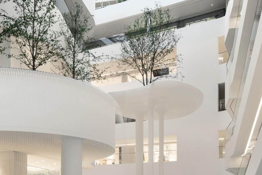
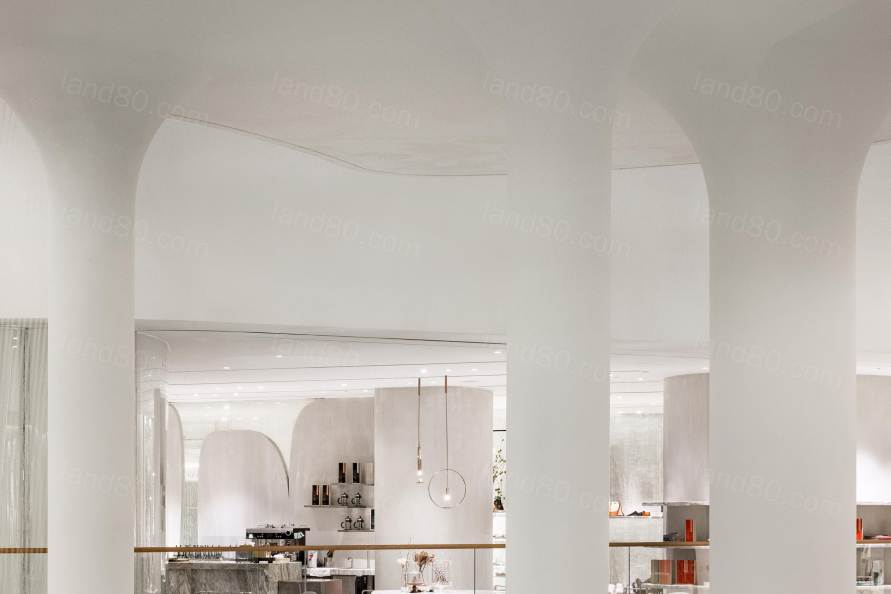
Burdifilek受委托设计百货商店的三层楼,包括在中庭打造禅宗般的氛围。商场的各层都可以看到中庭的柔和的元素,并通过延伸到建筑核心的天窗来获得充足的自然光。利用建筑独特的结构设计了一条绿化带,环绕着空间,为宁静和幸福的整体主题提供连续性。受大广场启发,绿化带成为了日常活动、社交互动和艺术展示,以及快闪舞台和美妙邂逅的场地。
Burdifilek was commissioned to design three floors of the department store, including the Zen-like ambiance of the atrium. The soothing elements of the atrium are visible from all levels of the department store, nourished by abundant natural light drawn in through a skylight extending through the core of the building. Leveraging the building’s unique architecture with multiple voids throughout, Burdifilek conceptualized a green belt that would wrap around the spaces and provide continuity to an overall theme of tranquility and well-being. Taking cues from the grand piazza, the green belt becomes a runway for everyday life activities from social interactions to art displays, pop-up stages and inspiring encounters.
▽中庭
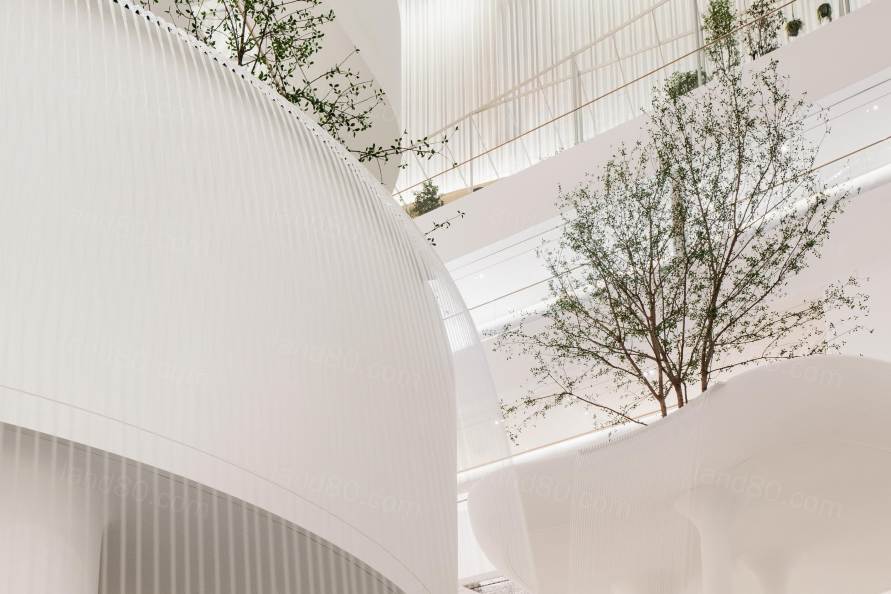
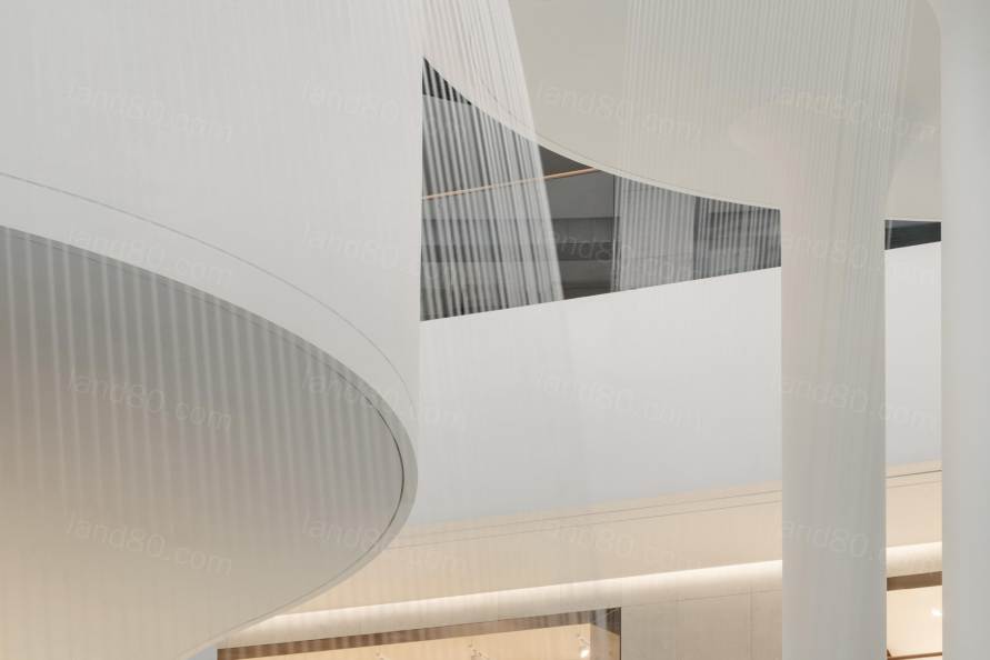
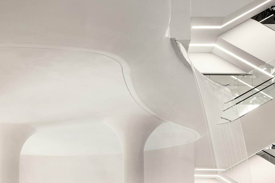
从层叠的瀑布发出的美妙声音开始的旅程,12米高的雕塑瀑布矗立在主中庭,周围环绕着有机形状的浮岛。宁静的瀑布花园通过舞动的水景倾泻而下,座位从其流线型的造型延伸而来。自然的概念得以展现,沿天花板内边缘的水波纹反光板,创造出池塘倒影的视觉效果。
One begins their journey with an auditory sensation of a cascading waterfall. A gravity defying 12-meter-tall sculptural waterfall stands prominently in the main atrium, surrounded by organically shaped floating islands. The calming Waterfall Garden cascades through dancing water features with seating extending from its fluid forms.
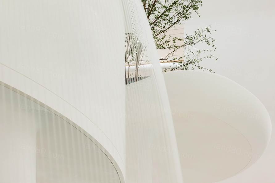
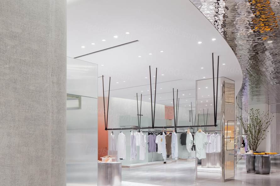
The concept of nature is carried forward with reflective borders that mimic tranquil water patterns along the inner edges of the ceiling planes, creating the visual effect of glancing up at a reflecting pond.
▽瀑布及浮岛
▽天花板上的水波纹反光板
"我们设计的是一个拥有许多中庭的大型建筑。客户的愿景是将50%的楼层面积用作公共空间,人们可以在比典型购物中心体验更多的体验环境中进行社交,"Burdifilek的联合创始人兼创意总监Diego Burdi说。"最后,我们的解决方案受到首尔周围自然环境的启发。我们选择将室外元素引入室内,创造一些意想不到的东西,随着绿色概念开始扩展到整个环境,建筑变得更加柔和,更有利于产生令人难忘的体验。”
“We were given a substantial piece of architecture with many atriums. Hyundai’s vision was to allocate 50 percent of this floor plate to create public spaces where people can socialize in a much more experiential environment than the typical mall experience has to offer,” says Diego Burdi, Co-founder and Creative Director of Burdifilek. “At the end our solution was inspired by Seoul’s surrounding nature. We chose to bring the outside in and create something unexpected that plays with scale and as the green concept began to extend to the whole environment the building became softer and more conducive to those memorable experiences.”
▽从中庭看向各层
诠释新语言Interpreting a new language
在构思各层的整体设计时,Burdifilek利用其经验和专业知识来完善每个元素的细节,以创建一个“整体大于部分之和”的品牌环境。从地板到墙壁,天花板,家具,固定装置和材料,每层设计都呈现出独特的体验和视觉元素,并且全部根据商品风格和顾客群体的生活方式量身定制。
In conceptualizing the totality of each floor, Burdifilek drew upon its experience and expertise to perfect the details of each individual element to create a branded environment that is strengthened by the sum of its parts. From floors, to walls, ceilings, furnishings, fixtures, and materiality, each floor presents its own dialect of experiences and visual display elements, all tailored to the style of merchandise and the lifestyle trends of those most apt to shop there.
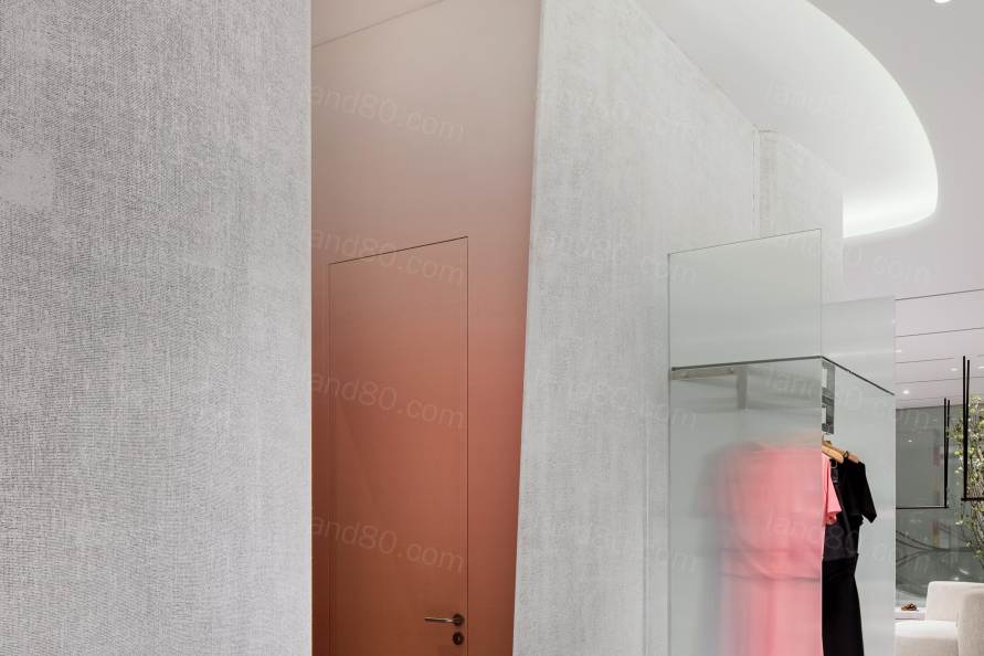
体验式色彩An experiential palette
二楼:雕塑花园 Second floor: Sculpture Garden
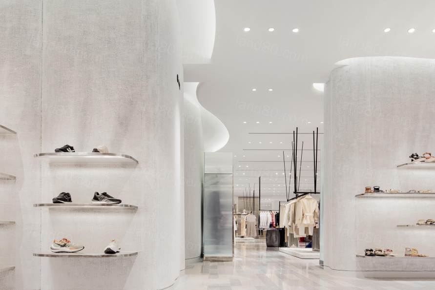
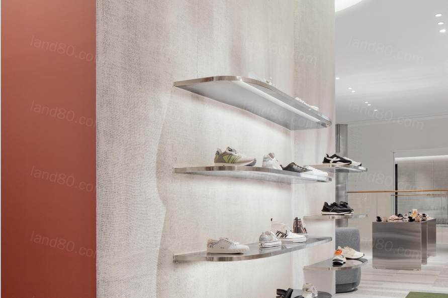
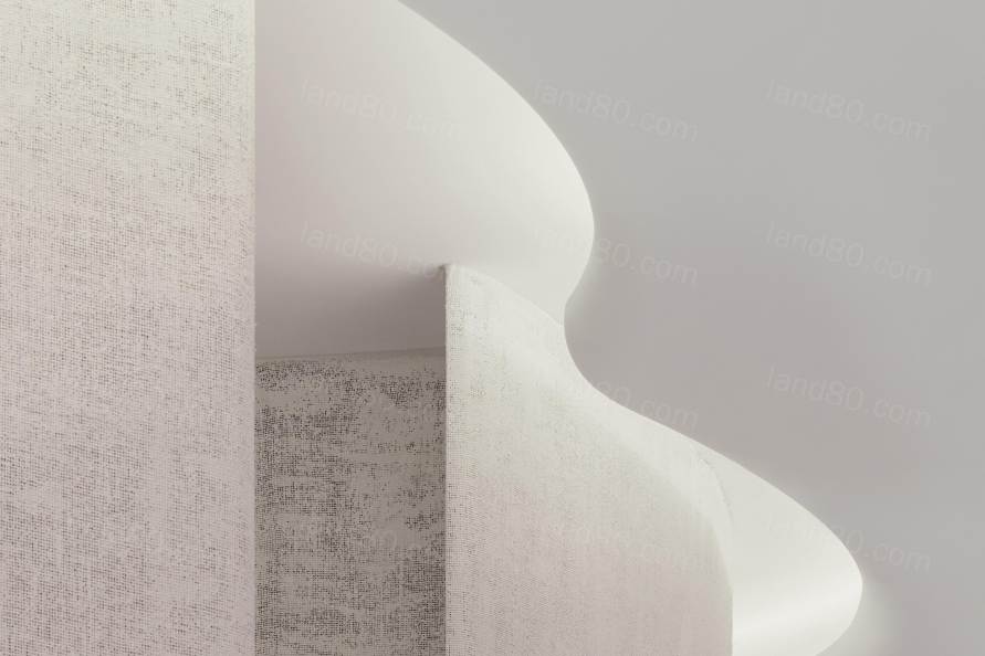
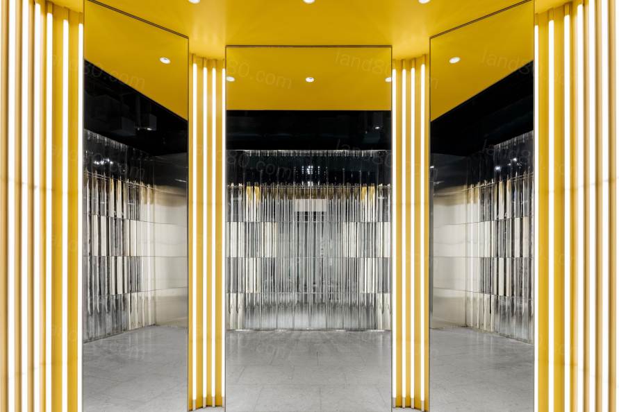
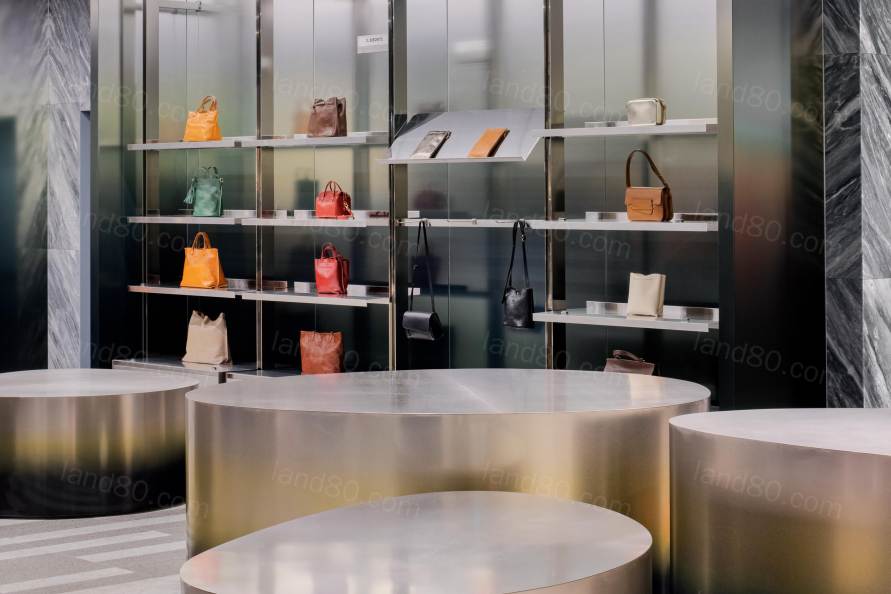
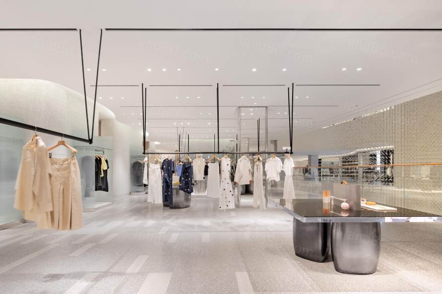
在二楼,Burdifilek对女性高端时尚未来家园的诠释是优雅和永恒奢华的核心。以标志性的形式为基础,强调纹理和雕塑色调,打造了一个画廊般的空间,供人们流连和探索。柔和的间接照明突出了天花板上的流线造型,散发出空灵的氛围。精致的定制悬挂灯具提升了轻盈感,同时为策划品牌提供了凝聚力。柔和的色彩与反射率和半透明效果的结合,进一步提升了精致的氛围。
On the second floor, Burdifilek’s interpretation of the future home for women’s high-end fashion is at the heart of elegance and timeless luxury. Anchored by iconic forms, with an emphasis on textures and sculptural tonality, the floor offers a gallery-like space for one to meander and explore. Use of gentle, indirect lighting accentuates fluid forms on the ceiling to radiate an ethereal quality. Custom hanging fixtures with refined detail elevates the feeling of lightness while providing a cohesive language for curated brands to shine. A combination of a subdued color palette with layers of reflectivity and translucency further boosts the sophisticated atmosphere.
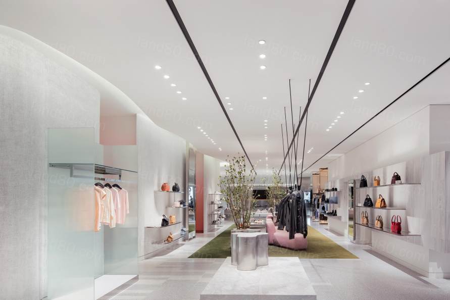
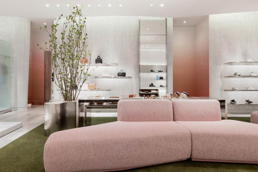
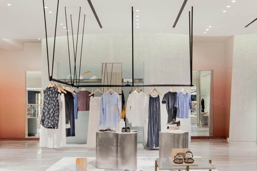
▽流线造型的天花板
三楼:狂野的荒原Third Floor: Provocative Wilderness
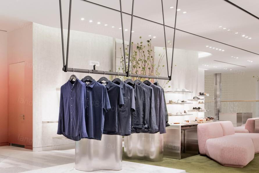
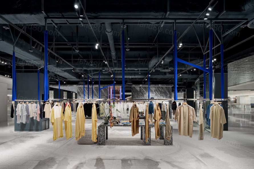
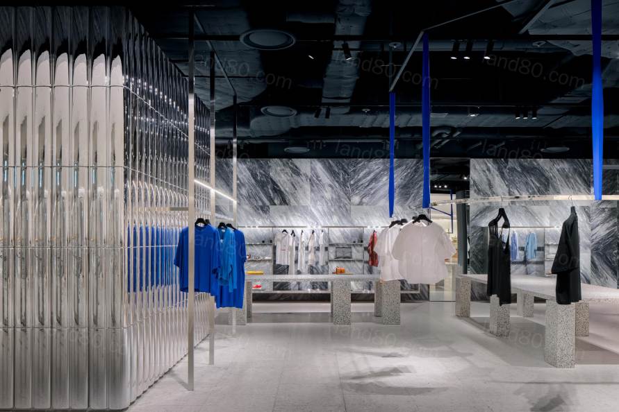
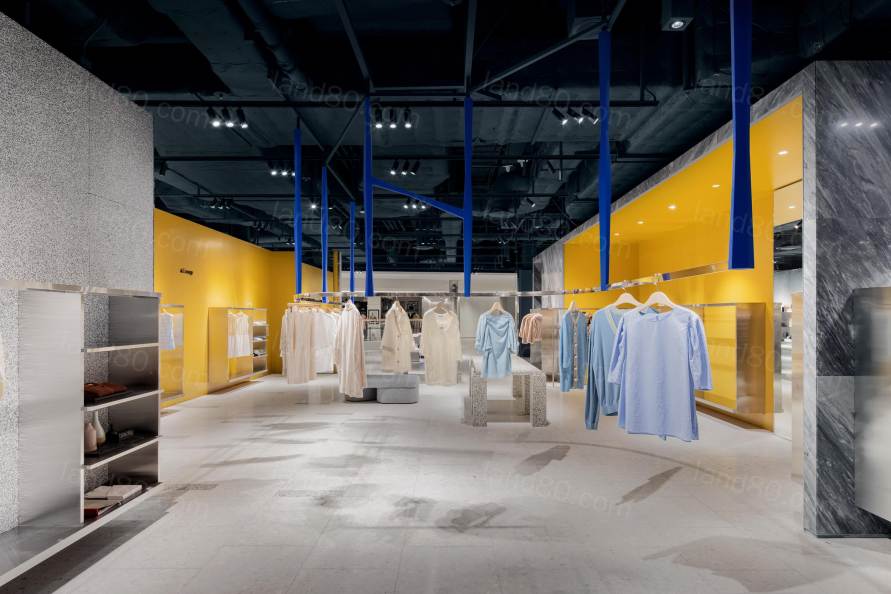
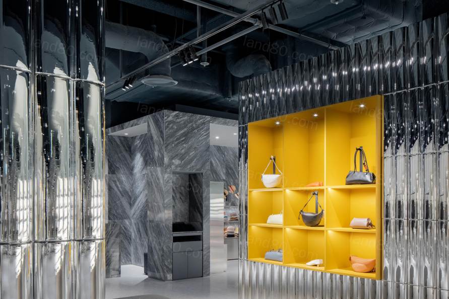
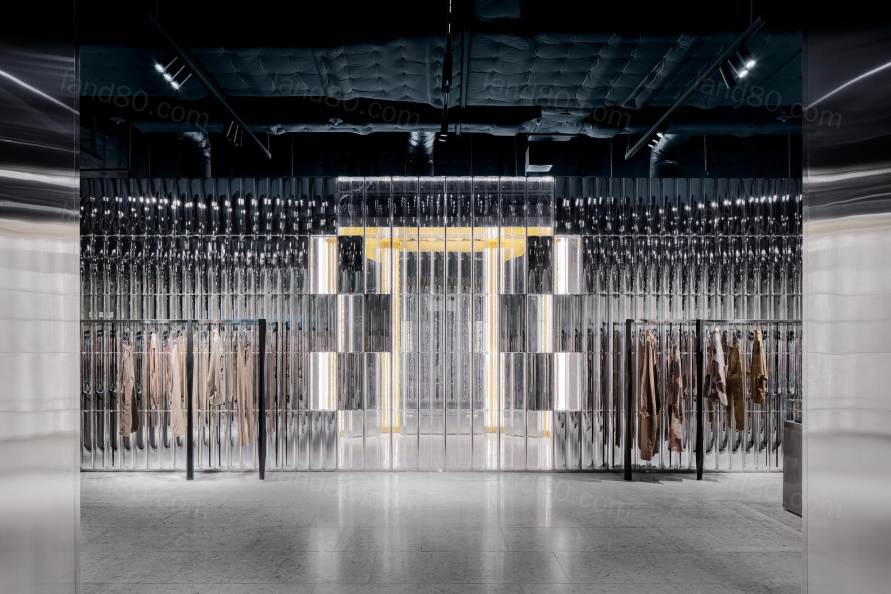
比起二楼,设计师在三楼迅速改变氛围,仿佛将人带入另一个世界。扩展了自然和雕塑花园的概念,三楼呈现出绽放的抽象形式。在雕塑元素方面与二楼保持一定程度的共性,同时该以更大胆的形式来表达它们,深蓝色悬挂结构为空间带来惊喜,大胆的选材,强调自然和人造材料的对比,未完成的天花板,定制的真空雕塑墙和简洁的色彩搭配,更直接地与特色品牌对话。在这个现代化商场中,艺术、设计和时尚的世界相互碰撞,创造出超越单纯购物的文化体验。
In Contrast, on the third floor, the designers swiftly change up the mood and invites one to another world. Expanding on the concept of nature and the sculptural garden, this level takes on the abstract form of a blooming. While maintaining a degree of commonality with the second floor in terms of sculptural elements, this floor expresses them in bolder form, amidst a creative backdrop of shocking deep blue hanging systems, aggressive materiality with an emphasis on the contrast of natural and man-made materials, unfinished ceiling, custom built, vacuum-formed sculptural walls and a simple color palette that speaks more directly to the featured brands. In this modern retail emporium, the worlds of art, design and fashion collide to create a cultural experience that transcends beyond a mere shopping experience.
“我们的设计理念是在每个楼层创造不同的环境,用不同的设计语言与特定人群交谈,同时以各种方式唤起空间中的自然性。我们还努力通过雕塑元素创造一些共性,让顾客产生共鸣,激起他们的好奇心和探索欲。”Diego Burdi称。
“Our philosophy was to create environments on each floor that would speak to a specific demographic, with a different design language while evoking nature in the spaces in various ways,” says Diego Burdi. “We also strived to create some commonality through sculptural elements that will resonate with the guests and give a physical experience of wondering and exploring.”
视角Perspectives
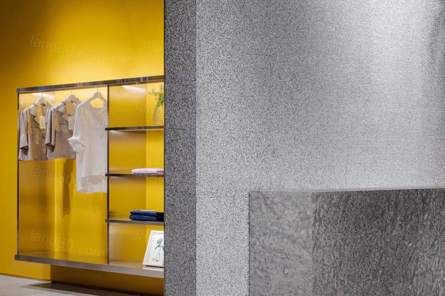
在这个充满野心的项目中,Burdifilek的愿景是创造一个强烈的视角,让使用者难以忘怀。为了避开全球零售空间的设计趋势,团队将首尔现代百货的楼层设计得易于接近,同时采用了刺激而富有创造性的设计元素和色彩。项目超越了传统的零售理念,为提升购物体验提供了独特的视角,成功巩固了Burdifilek作为国际知名定制设计工作室的声誉。
In approaching this ambitious project, Burdifilek’s vision was to create a strong point of view that would be memorable for the end user. In veering away from global retail trends, the firm designed the floors of The Hyundai Seoul to be easily approachable, while providing visionary design elements and color palettes that are both inspirational and aspirational. The project transcends traditional retail philosophy to offer a unique perspective on how common experiences like shopping can be greatly enhanced, and its successful completion reinforces Burdifilek’s reputation as an internationally renowned custom design studio.
"这个项目包含了许多要素,从零售和技术创新到卓越的设计和建筑,每个要素都带来了难忘的体验,"联合创始人兼管理合伙人Paul Filek说。
"与现代百货公司合作是一次理想的体验,因为这是一家非常注重设计的公司,在零售领域的创新方面具有面向未来的气魄。”Diego Burdi如是说。
“This project is a celebration of many ingredients from retail and technology innovation to exceptional design and architecture each contributing to a memorable experience.” says Paul Filek, Co-Founder and Managing Partner.
“Working with Hyundai was also ideal, as it is a very design-aware company with a future-oriented vision when it comes to innovation in the retail space.” says Diego Burdi.
Project Name: The Hyundai Seoul
Client: The Hyundai Department Store Group
Location: 108 Yeoui-daero, Yeoui-dong, Yeongdeungpo-gu, Seoul, South Korea - Part of Hyundai Parc 1 mixed-use complex
Spaces designed by Burdifilek for The Hyundai Seoul:
Ground Floor Atrium (Waterfall Garden) and Floors 2,3,4 (Selected Areas)
Areas:
Floor 2: 2,673 m2
Floor 3: 2,733 m2
Floor 4: 2,734 m2
Total area: 9,552 m2 (out of 89,100 m2 total area of The Huyndai Seoul)
Design Firm: BURDIFILEK
Design Team:
Paul Filek, Co-founder and Managing Partner
Diego Burdi, Co-founder and Creative Director
Tom Yip, Project Manager
John Seo, Sr. Concept Designer + Korean Translator
Michael Del Priore, Sr. Concept Designer
Shawn Li, Designer
Daniel Mei, Technical Designer (CAD)
Anna Nomerovsky, CAD
Anna Jurkiewicz, CAD
Yoonah Lee, CAD
Lighting Consultant: Marcel Dion
Project Sector: Full-Line Department Store
Project Completed: February 2021
Photographer: Yongjoon Choi Photography
|