把一个三层楼的停车场变成一个商业走廊,这是客户的要求。在每一个项目的开始,我们都会试着去了解要实现的目标是什么,只有这样,我们才会把建筑作为一种工具来实现这个目标。我们并不倾向于相信建筑本身就有价值,价值在于它所造成的,在于所实现的奇特目标。
Turn a three floors car
parking into a commercial gallery. In summary, this was the client’s request. At
the begging of each project, we try to understand what the object to be
achieved is, and only then we use architecture as a tool to achieve this goal.
We don’t tend to believe that architecture alone has value; the value is in
what it causes, in the peculiar objectives achieved. “Architecture is Action”,
Giancarlo Mazzanti.
▽入口空间 Entrance spaces
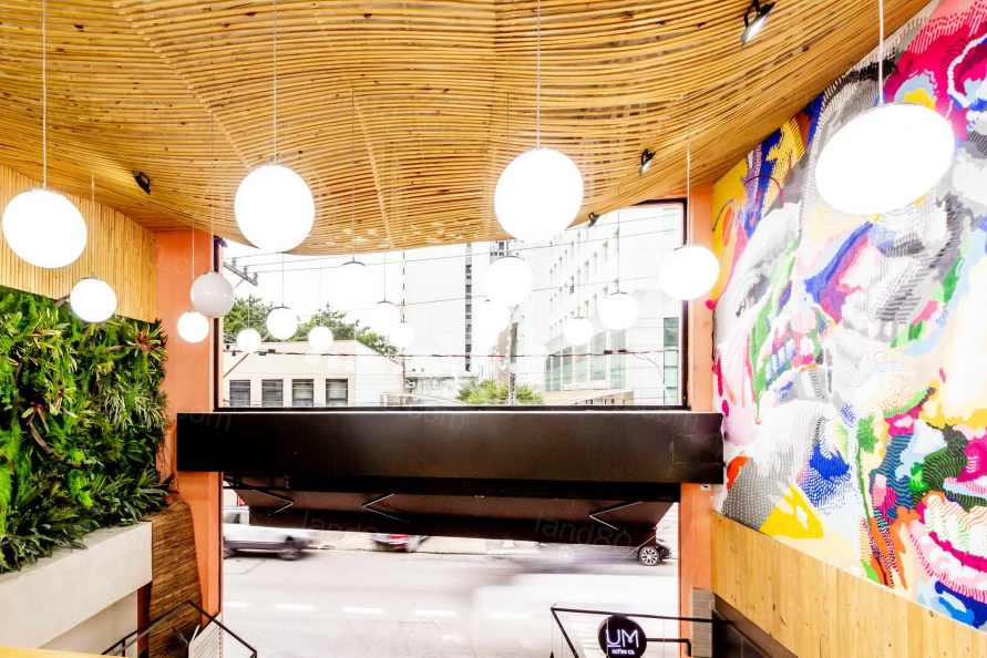
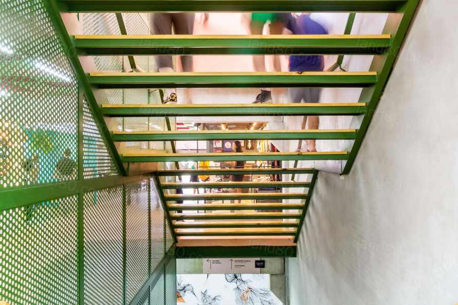
现有的建筑是建立在混凝土和空心板的预制结构系统上的,其中包含了用于楼层之间连接的车辆通道坡道,而底层则高出街道半层。由于取消了坡道,这对新的结构来说是无用的,我们将楼梯安置在新的跨度上,定义了垂直流线。此外,在入口处也存在着无障碍问题,因为一楼和街道之间的不平整。每当我们面对垂直通道的问题时,我们更倾向于建筑解决方案,如坡道而不是机械解决方案,但在这个特定的情况下,经过几次模拟,坡道解决方案被证明是不可行的,因为它最终会占用有用的面积。因此,我们将楼梯间旁边的电梯位置改为入口,解决了底层与其他楼层的连接问题。
The existing building was built on a precast
structural system of concrete and hollow slabs, containing vehicle access ramps
for communication between the floors, and the ground floor at a half level
above the street. With the elimination of ramps, that would be useless to the
new configuration, we positioned the stairs in the resulting spans, defining
the vertical circulation. There was also the problem of accessibility already
on the entrance with the unevenness between the first floor and the street
level. Whenever we faced problems of vertical access, we prefer architectural
solutions such as ramps over mechanical solutions, but in this specific case,
after several simulations, the ramp solution proved to be unfeasible sue to the
useful area it would end occupying. So, we change the position of the elevator
that would be next to the stairwell to the entrance, resolving the problem of
the ground floor and connecting with the other floors.
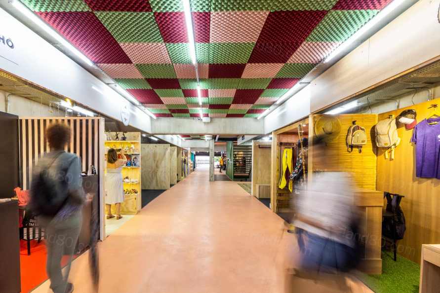
当解决了垂直流线的问题之后,我们开始解决空间内的“盒子”问题,“盒子”应该是一个标准化的、灵活的空间。基于建筑的维度,我们定义了“盒子”的标准模块维度,以满足未来时时发生的交通流线与中心占用的动态。该标准模块可以多次组合,以创建更大的空间。为支持这一动态特性,不仅包括空间,还包括不同类型的商业用途,并开发了带有插座的电动移动隔板,内置支架,以及其他产品。
With the vertical circulation resolved, we set out to
solve the boxes that should be, at the same time, standardized and flexible as
space. We defined standard modular dimension of the box from the dimensions of
the building, discounting circulation and central occupation dynamics that
would happen in future moments. This standard module can be combined in
multiples, creating larger boxes. To support this dynamic, not only of spaces
but also different types of commerce, and electrified mobile partition with
sockets and built-in rack rails for shelves and other product supports, was
developed.
▽室内走廊空间 Interior spaces
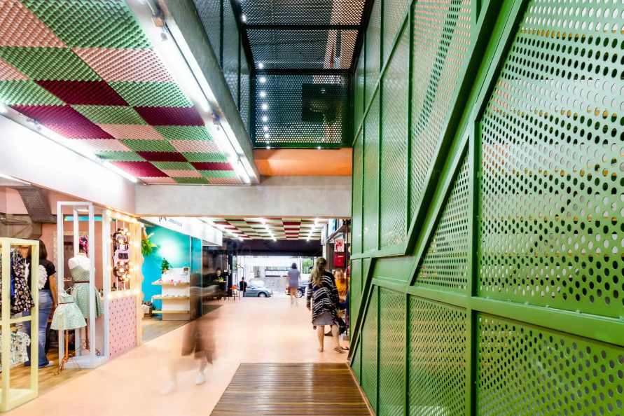
选择了单体型的地板延伸到项目中,如同从大桶中倒出的液体,爬墙、下楼梯,在不同的表面涂上代表轻盈、精致、活力、新鲜和喜悦的颜色。我们仍然不知道有关颜色的应用方式,是否有可能唤起所有这些感觉,但在关于内部和外部的讨论中,它是最接近这些感觉的颜色。在入口处,一楼的楼板被拆除,因为现有的天花板比较低,让一些人产生幽闭的感觉,新的天花板不仅满足了空间所必需的双层高度,而且会吸引人流进入空间内。
A monolithic type floor was chosen to extend into the
project as a liquid poured from a large bucket, climbing walls, descending
stairs and painting different surfaces with a color that represents lightness,
delicacy, energy, freshness and joy. We still don’t know whether the color in
question, in the way it was applied, has the potential to evoke all these
feelings, but it was the color that came closest to them, in internal and
external discussions. At the gallery entrance, the first-floor slabs were
removed, creating a double height necessary for the new configuration, as the
existing ceiling was relatively low, which would not generate an invitation to
visit and could generate a claustrophobic sensation in some people.
▽项目颜色搭配 Choose of the colors
▽拆除了二楼天花板给入口带来了通透明亮的空间 The removal of ceiling creates a bright space for the entrance
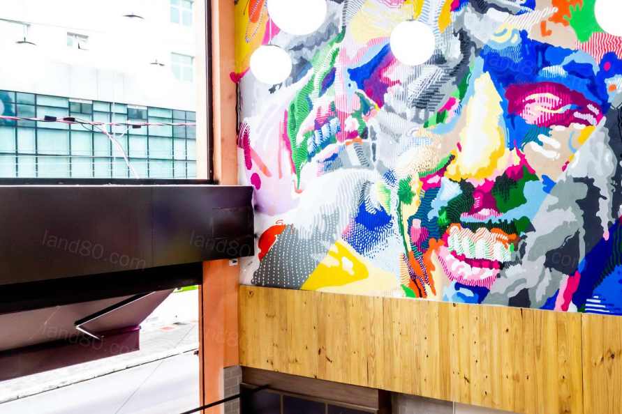
在入口的覆盖范围内,我们向TakêConsultoria的Thomas Takeuchi进行了咨询,生成了一个参数化的衬里。我们的想法是给预制混凝土套装更多的有机性,创造一个元素,吸引路人的注意,同时也容易执行。除了有机覆盖,我们还邀请了视觉艺术家Adriano Franchini,在其中一面内墙上创造了一个面板,为入口带来更多的活力,从而加强了空间的邀请感。
In the entrance coverage, we generated a parametric
lining in consultancies carried out with Thomas Takeuchi from TakêConsultoria.
The idea was to give more organicity to a precast concrete set, creating an
element that caught the passer’s attention and at the same time was easy to
execute. In addition to the organic coverage, we invited the
visual artist Adriano Franchini, to create a panel on one of the internal
walls, bringing even more vitally to the entrance, thus reinforcing the
invitation.
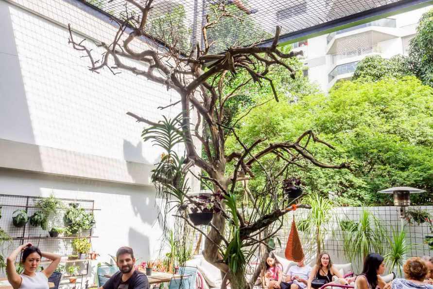
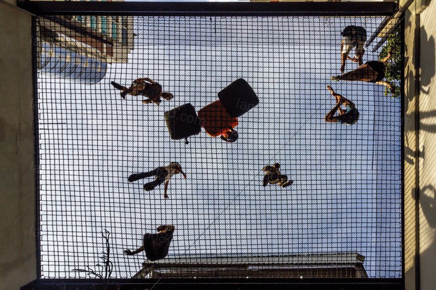
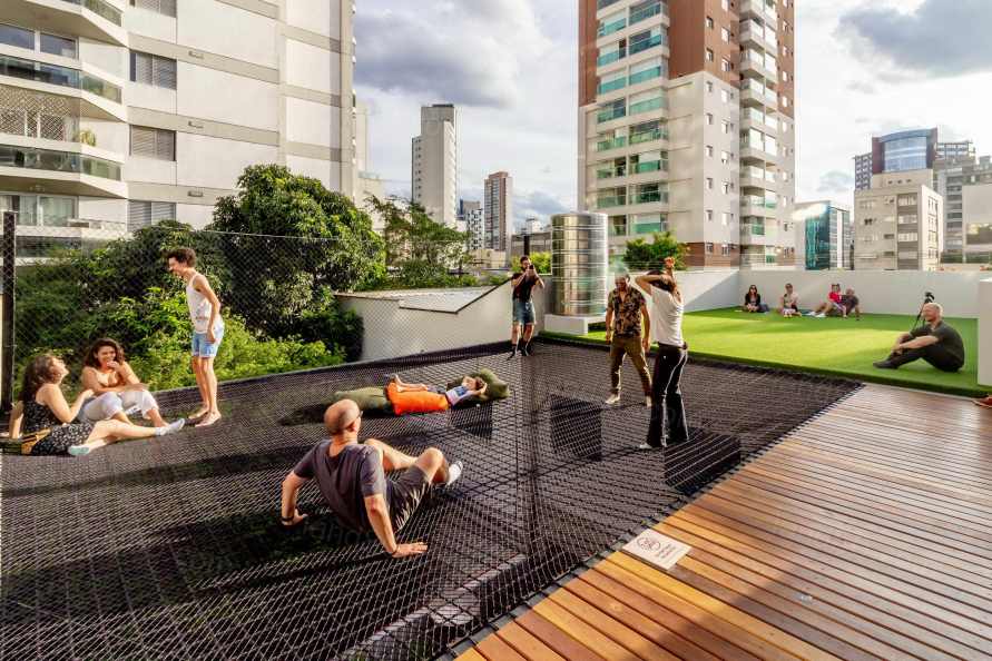
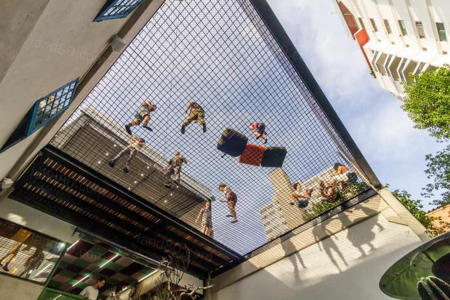
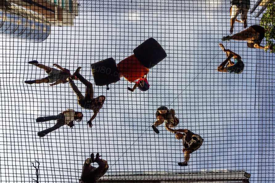
由于项目中需要扩大自然采光和通风的入口,我们还拆除了背面的夹层结构。而作为商业走廊的邀请和有机的传播策略,我们在这个空间里建立了一张大网,让参观者在不需要支付任何费用的情况下,就能享受到一个完全不同体验的商业空间。在整个项目中,我们试图产生一些城市的温柔,从而加强生活在某个城市的幸福感。我们通过叙事来创造。 一个家庭走过这个地区的可能性,进入走廊,坐在网中,跳跃,玩得很开心,不需要支付任何东西,而这是在一个私人的设备中,至少是一种善意,一种亲切,在大城市中是如此罕见的东西,尤其是粗糙的圣保罗。而且这种姿态不会给业主造成损失,相反,这个空间在社交网络上被有机地认知和传播,在空间在中产生流量。
Due to the need to expand the entrance of natural
lighting and ventilation in the project, we also removed the mezzanine
structure at the backs. And as an invitation and organic dissemination strategy
for the gallery, we created a large net in this space for visitors to enjoy a
commercial space with a totally different experience, without the need to pay
anything for it. Throughout the project we try to generate some urban
gentleness, which reinforces the feeling of well-being in living in a certain
city. We create by narratives. The
possibility of a family walking through the region, entering the gallery,
sitting in the net, jumping, having fun, without the need of paying something,
and this in a private equipment, is at least a kindness, a cordiality,
something so rare in large cities, especially rough São Paulo. And this gesture
will not cause losses to the owner, on the opposite, the space is being known
and disseminated organically on social networks, generating flow through the
gallery.
创造新的建筑机制,让私人投资合作改善城市生活状况,同时为投资者带来回报,是项目的运作模式。
Creating architectural mechanisms that allow private
investments in collaboration to improve the condition of urban life, while the
same time bring return for the investor is a new paradigm of action in
projects.
Project name: Calixto Gallery
Company name:Estúdio HAA!
Website:https://www.ha.arq.br/
Contact e-mail:contato@ha.arq.br
Project location:Rua Teodoro Sampaio, 1027, Pinheiros – São
Paulo – SP- Brazil
Completion Year:2019
Building area (.0m²):1.000 .0m²
Photo credits:João Lopes- Bevah Fotografia
|