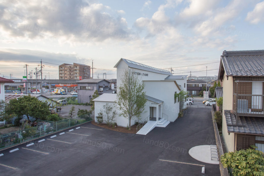
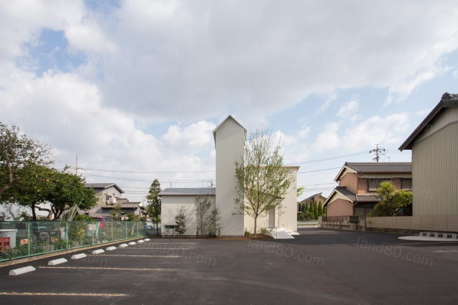
场地呈长形,北侧面向4车道公路,南侧为4米宽,道路沿线的城市景观变得空旷。项目计划在此设计家建造一个牙科诊所,进行医美牙科和儿科牙科的活动。
The site is a long shape facing the 4-lane highway on the north side and 4 meters wide on the south side, giving void to the townscape along these roads. The plan described here is building a dental clinic specializing in aesthetic dentistry and pediatric dentistry here.
考虑到病人的不同,我们认为牙科诊所应该根据不同的活动来安排不同的空间,例如:接待→等候→刷牙角→治疗室→X光片→治疗室→等候→付款,我们将诊所的每个房间视为目的地,将流线转化为建筑本身的空间结构。具体来说,为了符合场地的方向性,在建筑物的中心设置了一条长廊,在建筑物的两侧设置了必要的不同类型的房间。在过道里,天花板表面的处理是通过增白表面来完成的,这欺骗了人们对房间真实尺度的感知,让我们感受到空间的延展性。因此,在建筑里的人们可以全天的感受到外部空间的变化。建筑物中心的自然光的变化防止了对隐私的过度考虑,从而产生限制感。
Considering the empiric position of the patient, we feel that a dental clinic should be abele to contain various parts according to the different activities. For example, reception → waiting → tooth brushing corner → treatment room → X-ray → treatment room → waiting → payment. In order to translate the act of movement into the structure of architecture itself, we considered each rooms of the clinic as the destinations and transposed "→" into an aisle connecting them together. Specifically, in order to conform to the directionality of the site, a long aisle is set at the center of the building, and necessary rooms that become destinations are arranged on both sides of the building. In the aisle, processing was done on the ceiling surface by whitening the surface deceives the human perception of the real size of the room and ends as a door that allows us to feel the extensibility of the space. As a result, the whole planned as a sensory outside space where the state of light changes throughout the day. The sensory outside which changes according to the natural light installed in the center of the building has connection with each room, thereby preventing excessive consideration on privacy from which leads to a sense of limitation.
每个房间的大小和设计都不一样,对于病人和工作人员来说,房间之间的感觉会随着植物、光线强度和建筑结构的不同而改变。随着建筑物和外部环境的变化,会给建筑里的人们带来一些不同的空间体验。
The volume and setting of each room changes according to their destination. For both patients and staff, between rooms involve a change in perception as plants, intensity of light and architecture vary from room to room, and it waits. As buildings and external environments change, users will accumulate several different spatial experiences.
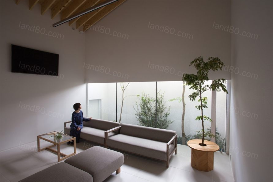
我们在过道和房间之间设计了一个拱形的“边界”。这种在垂直方向上不对称的形状,有意识的让人们感受到房间的开放性和可及性。金属涂层覆盖在拱的表面,其表面随光而急剧变化,这种“边界”将行人从过道中释放出来,到达每个房间。
We designed an arch shaped "boundary" between the aisle and the rooms. This shape, which is not symmetrical in the vertically direction, makes those who are in the aisle aware of the openings and accessibility of the rooms. Furthermore, the repeated arched shape homogeneity encourages the passage to be organized in the Gestalt principle. A metal coating covers the surface of the arch as a foreign object whose expression changes radically with the light. The passage of this “boundary” releases us from the aisle and reaches to the destination.
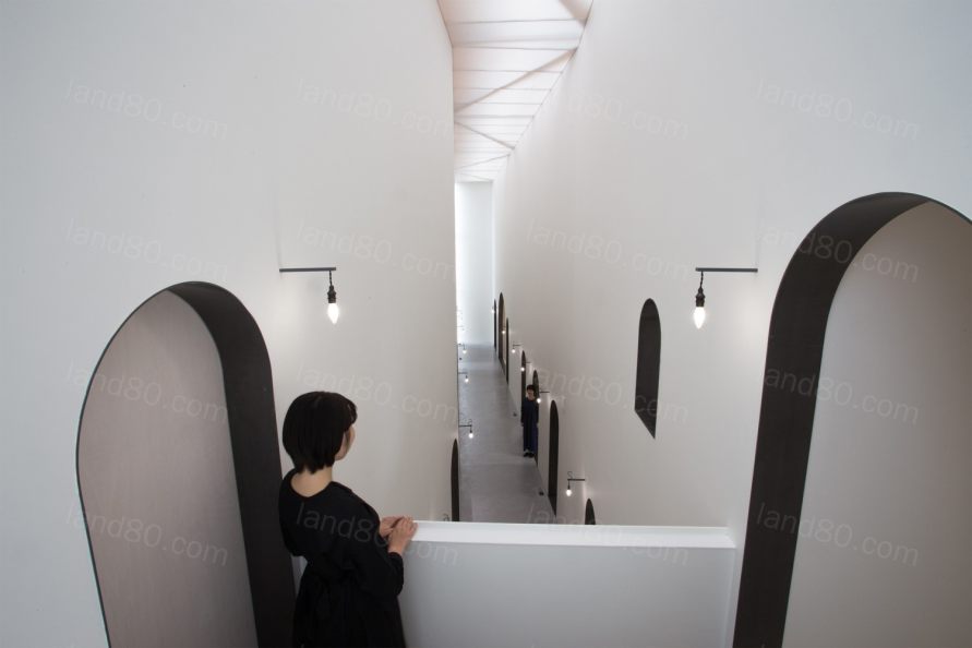
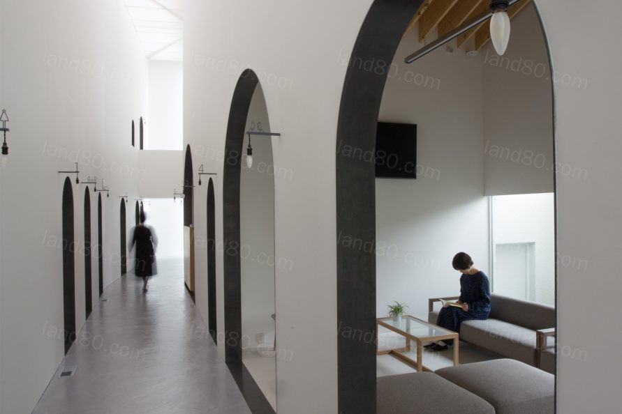
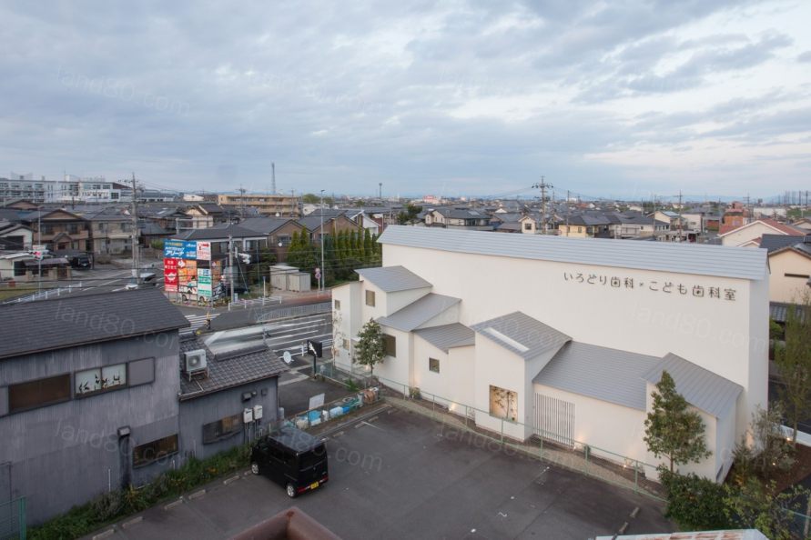
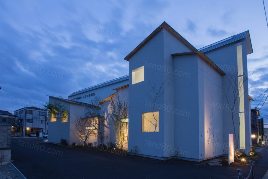
从外部看,通道部分不仅垂直突出,而且水平突出,但并未因此在整个街区产生违和感。在窗户上放置的大量植物,既保证了隐私感,又始终给人一种室外开放的感觉。
From the outside, the part of the passage protrudes not only vertically but also horizontally, and guarantees the directional understanding of the site in relation to the city. The neighborhood does not fell any pressure or protrusion of the aisle thanks to the rooms that are attached to it. By positioning windows and plants differently between the inside and the outside, a feeling of privacy is guaranteed, while always giving a sense of openness of the outside.

▼平面图

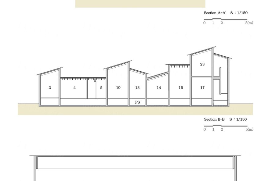
▼剖面图
设计单位:1-1建筑师(山口由纪+石川昭一)
项目梦晨:NK诊所
地点:日本爱知县
主要用途:牙科诊所
结构:木质
场地面积:808.91 m 2
建筑面积:192.37平方米
总建筑面积:227.13 m 2
外饰面:
屋顶/镀锌钢板t=0.35mm
外墙/喷漆
开口/窗扇,木质窗扇,
内部饰面:
地板/瓷砖、砂浆、乙烯基地板砖、软木砖
墙面/喷漆
天棚/日本柏木胶合板+结构木+油画、亚克力板
设计时间:2016年10月-2017年8月
建设期:2017年9月-2018年4月
结构设计:Tatsumi Terado结构工作室
建设单位:马鲁乔家居有限公司。
景观设计:恩佐股份有限公司。
Planning data
Title:Clinic NK
Location: Aichi, Japan
Main use: Dental clinic
Structure: wooden
Site area: 808.91 m 2
Construction area: 192.37 m 2
Total floor area: 227.13 m 2
External finish
Roof / galvanized steal plate t = 0.35 mm
Exterior wall / spraying paint
Openings / waluminum sash, wooden sash,
Interior Finish
Floor: porcelain tile, Mortex, vinyl floor tile, cork tile
Wall / spraying paint
Ceiling / Japanese cypress plywood + structural wood + oil stein painting, Acrylic plate
Design period: October 2016 - August 2017
Construction period: September 2017 - April 2018
Design: 1-1 Architects(Yuki Kamiya + Shoichi Ishikawa)
Structure design: Tatsumi Terado Structural Studio
Construction: MARUCHO HOME Co., Ltd.
Landscape design:ENZO. co.,ltd.
|