位于孟买的PCJF技能发展中心是一个企业社会责任项目,旨在创造一个鼓舞人心的学习环境。设计理念侧重于为该机构精心打造多功能空间,强调有效的空间利用和声学设计,以控制升高的声音水平,同时打破典型和陈旧的教室。该场地之前被用作商业建筑顶层的体育馆,笨重的横梁、独立的柱子造成了死角,自然通风极少。这个区域需要被改造成一个中心,在这里人们可以得到实际的训练,并在一个没有杂乱的环境中容纳重型机械。
The PCJF Skill Development Center in Mumbai is a CSR project designed to create an inspiring and encouraging learning environment. The design concept focuses on crafting multi-functional spaces for the institution, emphasising effective space utilisation and acoustics to control elevated sound levels while breaking away from the typical and cliché classrooms. The site was previously used as a gymnasium on the top floor of a commercial building- with bulky beams, stand-alone columns creating dead spaces and minimal natural ventilation. This area needed to be converted into a centre, where one could get hands-on practical training and accommodate heavy machinery within a clutter-free environment.
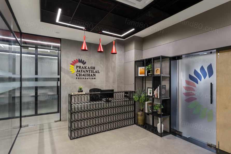
设计方法无论从功能上还是从审美上,都旨在利用整合在空间内的每一个元素、物体和材料,以一种以上的方式使用它们,并最终以最小的改动改造房间,从而确保空间的多功能性。为了实现这一目标,空间设计围绕着有限地使用不同的材料和颜色,并在整个空间中发挥纹理和网格以及线性图案。在空间上,该空间已根据现场的窗户位置进行了划分,所有的教室都有窗户,以加强用户的学习过程,而后端办公室和公用事业区则被规划在建筑的后部。为了确保教室的最大空间利用,已经创建了最小的流通空间。一条通道作为整个空间的脊柱,连接着5000平方英尺的单层楼板的各个房间。
The design approach, both functionally and aesthetically, aims to capitalise on every element, object and material that is integrated within the space by using it in more than one way and ultimately transforming the room with minimal alterations, thereby ensuring versatility within the space. To achieve this, the space design revolved around limited use of varied materials and colours and with the play of textures and grids and linear patterns throughout the space. Spatially, the space has been divided as per the window locations on site. All classrooms have been lined by the windows to enhance the learning process for the user, and the back-end office and utility areas have been planned towards the rear part of the building. To ensure maximum space use in the classrooms, minimal circulation spaces have been created. A single passage acts as a spine to the entire space and connects the various rooms of the single 5000 sq. ft. floor plate.
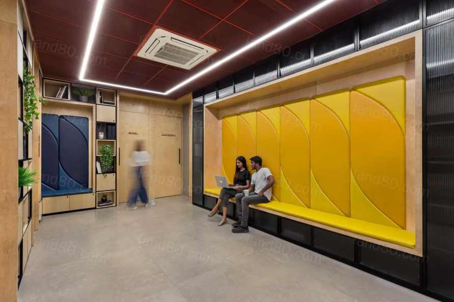
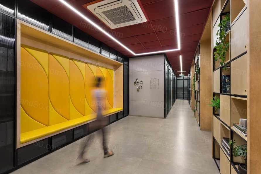
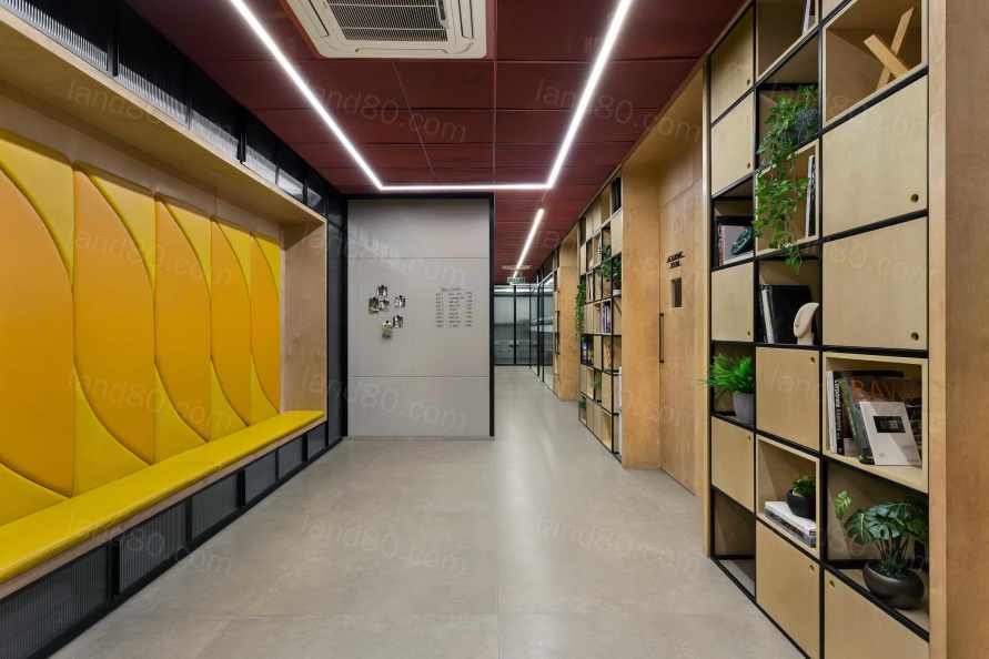
根据开发控制指南,每个教室所需的空间在现场是不够的。为了克服这一限制,一个单一的空间被以多种方式使用,以提供最大的使用率并增强空间体验。例如,只需打开镜面滑动的折叠式隔板,并重新安排零售班的家具,两个沙龙就能合并成一个房间。由于两个沙龙的空间都是相同的,所以两者的合并是无缝的。存储单元被分布在柱子周围和墙壁上,以创造耐人寻味的墙壁设计和功能性存储空间。例如,电子实验室需要大量的工具,这些工具被存放在墙上,从而创造出有趣的墙面装饰。通道两旁的存储单元给人以图书馆般的感觉,壁龛被设计成精心制作的座椅,看起来就像从存储墙中雕刻出来的。为了弥补低矮的天花板,使用钢丝网板作为天花板的覆盖物,有助于给它一个更轻的外观,并在视觉上拓宽空间。
As per the development control guidelines, the space required for each classroom was insufficient on-site. To overcome this constraint, a single space has been used in multiple ways to provide maximum usage and enhance the spatial experience. For instance, both the salons combine into one room by merely opening a mirror sliding folding partition and by rearranging the furniture in the retail class. Since both the salon spaces are identical, the merging of the two is seamless. Storage units have been distributed around columns and on walls, to create intriguing wall designs and functional storage space. For instance, the electronic lab requires a large number of tools that are stored on the wall, thereby creating interesting wall decor. Passages are lined with storage units that give a library-like feel, and niches have been designed to craft out seating that looks like it has been carved out of storage walls. To compensate for the low ceiling, the use of wire mesh panels as the ceiling covering help give it a lighter look and widen the space visually.
可移动的家具是设计的关键;因此,它的设计和定制是为了在不使用时可以收起来,并根据需要移动。每一个角落、家具和空白处都有其实用价值,因此形成了一个开放的布局,没有杂乱的空间。
Movable furniture was critical to the design; it is therefore designed and customised to be stowed away when not in use and moved around as per requirement. Every corner, furniture piece and blank space has a utilitarian value, thereby resulting in an open layout with clutter-free spaces.
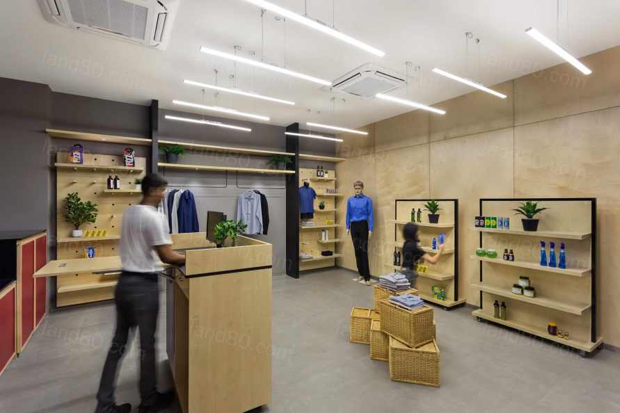
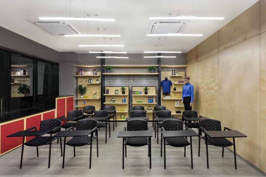
由于学生和工作人员的不断移动,以及培训时使用的工具和机器,该学院必须进行声学处理。具有声学特性的预制墙板被用来作为Siporex墙体的有效和经济的替代品,以确保教室内的干扰最小。大量使用需要较少处理和低维护的材料,如墙壁和家具上的桦木板、地板上的混凝土砖、石灰灰泥墙、凹槽玻璃、M.S.家具和金属网板。使用不同材料和纹理的低调灰色调,以创造一个微妙的背景。充满活力的品牌色彩赋予了整个空间以突出的特征。隔断设计、照明设计和通过家具元素创造的图形的形式,都有助于创造一个低调的模式,让大胆的形式,如标志设计,得到突出。
With the constant movement of students, staff, and the use of tools and machinery while training, the institute had to be acoustically treated. Prefabricated wall panels with acoustical properties are used as an effective and economical substitute to Siporex walls to ensure minimal disturbance within classrooms. There is extensive use of materials requiring fewer treatments and low maintenance, like birch ply on walls and furniture, concrete tiles on the floor, lime plastered walls, fluted glass, M.S. furniture and metal mesh panels. A muted grey palette in different materials and textures that are low on maintenance is used to create a subtle backdrop. The vibrant brand colours endow identity stand out as a highlighting feature across the space. Clean, stark lines in the form of partition designs, lighting design and the graphics created through the furniture elements, all aid in creating an understated pattern, allowing bold forms such as the logo design to get highlighted.
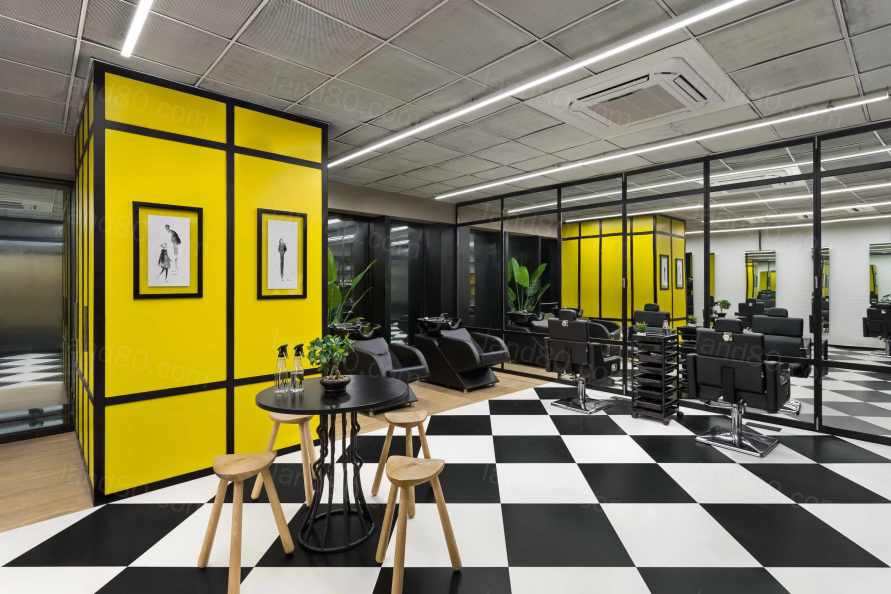
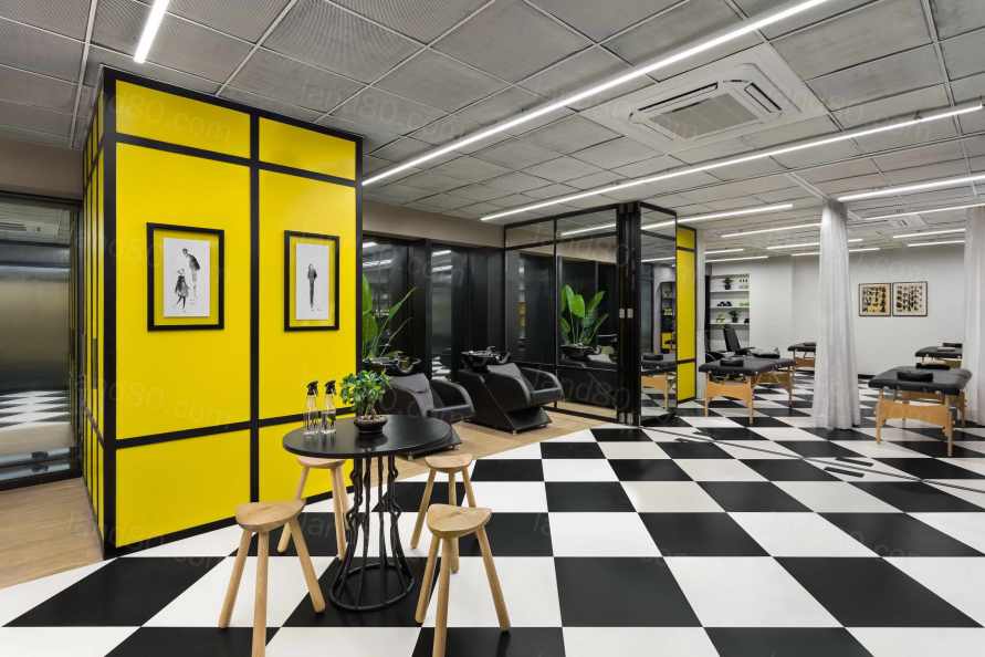
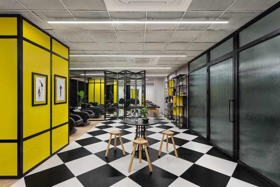
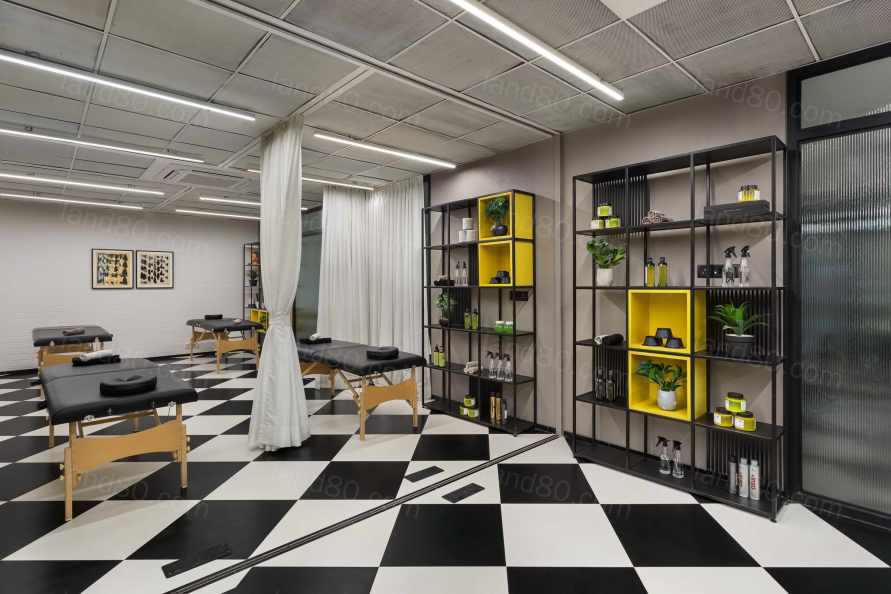
整个空间遵循现代而简约的模式和网格,以增强功能,并增加空间的多功能性。其结果是一个毫不费力的实用设计方案,使用户保持参与感和好奇心,同时激励他们在一个感官舒缓、高效的学习环境中学习、交流和培训。
Modern, yet minimal patterns and grids are followed throughout the space, in order to augment functionality as well as adding versatility to the space. The result is an effortlessly practical design solution that keeps the user engaged and intrigued, whilst motivating them to learn, network and train in an environment that is soothing to the senses and efficient for learning.
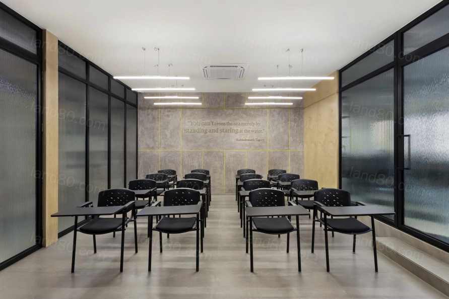
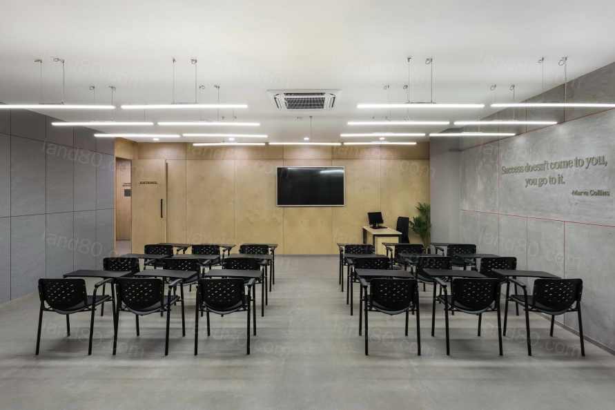
Project: PCJF SKILL DEVELOPMENT CENTER
Design Firm: Studio NACL
Typology: TRAINING INSTITUTE, SKILL DEVELOPMENT CENTER, CSR PROJECT
Location: MALAD (W) , MUMBAI
Name of Client: PRAKASH CHAUHAN JAYANTILAL FOUNDATION
Name of Client’s Firm: PARLE AGRO (but client prefers not to use their name)
Principal Architect: NATASHA AGGARWAL
Design Team: NATASHA AGGARWAL , JUHI THAKKAR
Site Area (sq ft & sq m): 5000 sft / 464.50 sqmt
Start Date: JULY 2019
Completion Date: DEC 2019
Photographer: KUNAL BHATIA
|