新的苏黎世艺术馆扩建工程由位于的柏林David Chipperfield建筑事务所设计,扩大了位于格罗斯明斯特教堂和大学之间的现有艺术馆。苏黎世艺术馆目前是瑞士最大的艺术博物馆,由四座不同时期的建筑组成--莫泽大楼(1910年)、普菲斯特大楼(1958年)、穆勒大楼(1976年)和现在的奇珀菲尔德扩建工程(2020年)。新的独立建筑内收藏了古典现代主义、Bührle收藏、临时展览和1960年以后的艺术作品。根据2007年发布的中央校园总体规划,博物馆建筑和位于城市广场Heimplatz东侧的Schauspielhaus剧院,形成了一个艺术的门户,作为教育里程的城市入口。在这里,苏黎世各大学的大型独立建筑像一串珍珠一样向北延伸。
The new Kunsthaus Zürich extension, designed by David Chipperfield Architects Berlin, expands the existing Kunsthaus museum, situated between the Grossmünster church and the university. The Kunsthaus Zürich now represents the largest art museum in Switzerland, comprising four buildings from different eras – the Moser building (1910), the Pfister building (1958), the Müller building (1976) and now the Chipperfield extension (2020). The new freestanding building houses the collection of classic modernism, the Bührle collection, temporary exhibitions and art from 1960 onwards. Based on the Central Campus masterplan published in 2007, the museum buildings and the Schauspielhaus theatre located on the east side of the urban square Heimplatz, form a gateway of the arts as an urban entry to the education mile. Here, the large freestanding buildings of Zurich’s universities are lined up like a string of pearls leading northwards.
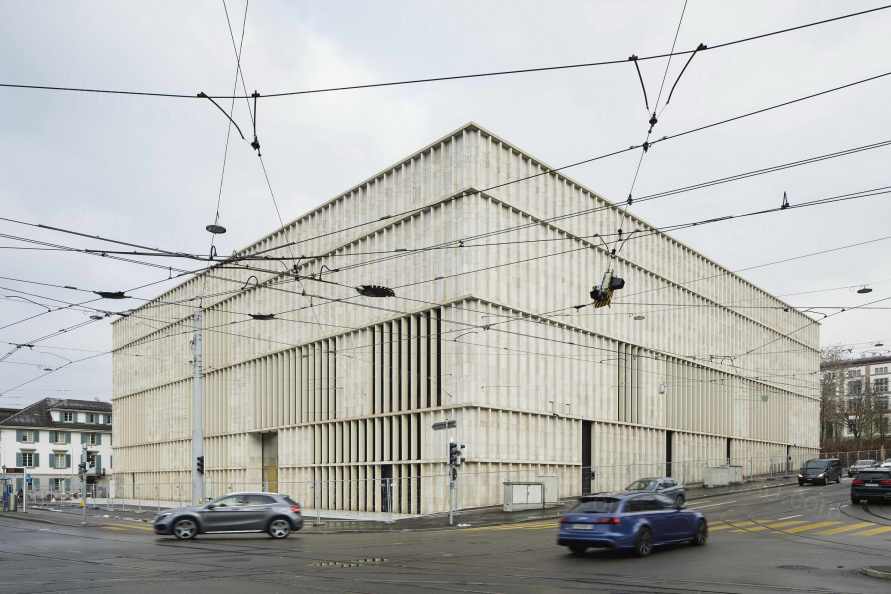
扩建的城市概念设想在广场的北部边缘放置一个清晰的几何体量。建筑形式的灵感来自于场地北部建于1842年的老州立学校,它以其清晰的建筑风格定义了城市框架。城市规划定义了两个新的外部空间:南面的城市广场,四面被建筑框住,北面的新艺术花园是一个开放的、可渗透的自然环境。一个横跨整个建筑的宽阔的入口大厅在这两个新的城市空间之间建立了联系。由于其低门槛的无障碍性,它同样成为机构和城市之间的公共联系。广场下方的游客通道将新建筑与现有的艺术馆连接起来,形成一个机构实体。
The urban concept for the extension envisaged the placement of a clear geometric volume on the northern edge of the square. The building form takes inspiration from the old cantonal school, built in 1842 to the north of the site, which defines the urban frame with its architectural clarity. The urban plan defines two new external spaces: the urban square to the south, framed on all four sides by buildings and the new Garden of Art to the north as an open and permeable natural environment. An expansive entrance hall, spanning the full length of the building, creates a link between these two new urban spaces. Due to its low-threshold accessibility it likewise acts as a public link between the institution and the city. A visitor passageway running underneath the square connects the new building with the existing Kunsthaus, creating one institutional entity.

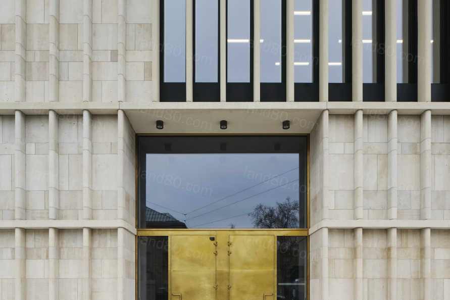
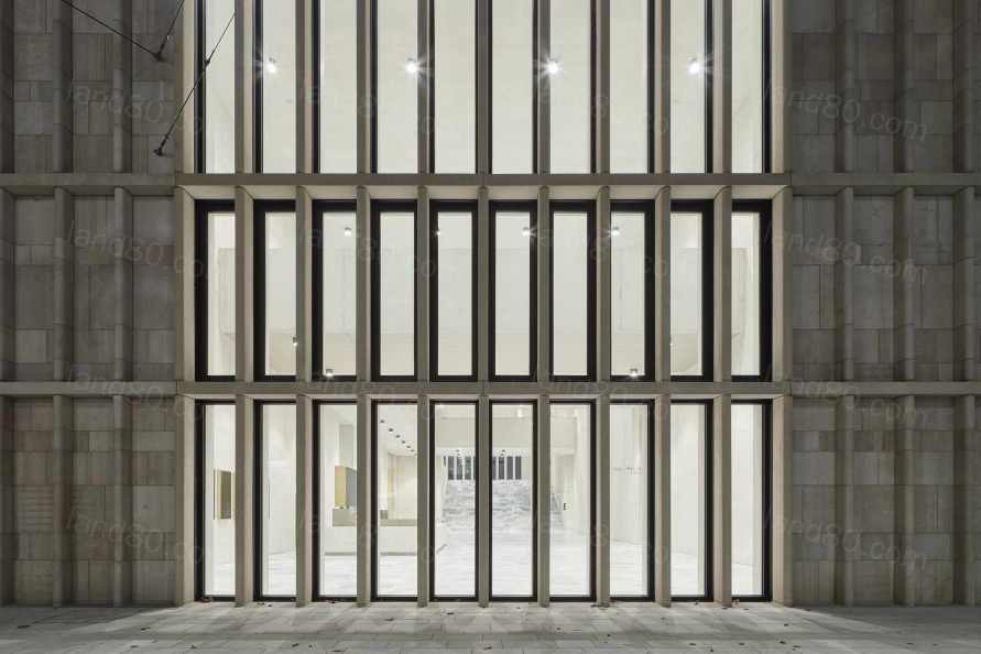
建筑特征是以传统的石质外墙为蓝本,就像苏黎世现有的艺术馆和许多其他重要的公共建筑一样。因此,扩建部分嵌入了一种建筑文化,这是一个开明的公民社会的表现。新建筑将传统与创新结合起来,通过用当地侏罗纪石灰石制作的细长的竖向鳍片,锯开表面,并以固定的间隔放置在立面上,以现代的方式将建筑嵌入其城市和文化背景中。
The architectural identity is modelled on traditional stone façades, as found in the existing Kunsthaus and many other significant public buildings in Zurich. The extension is therefore embedded in a building culture that is an expression of an enlightened civil society. The new building combines tradition and innovation through slender vertical fins crafted from local Jurassic limestone with sawn surfaces and placed at regular intervals in the façade, embedding the building it its urban and cultural context in a contemporary manner.
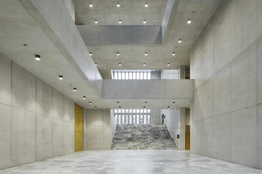
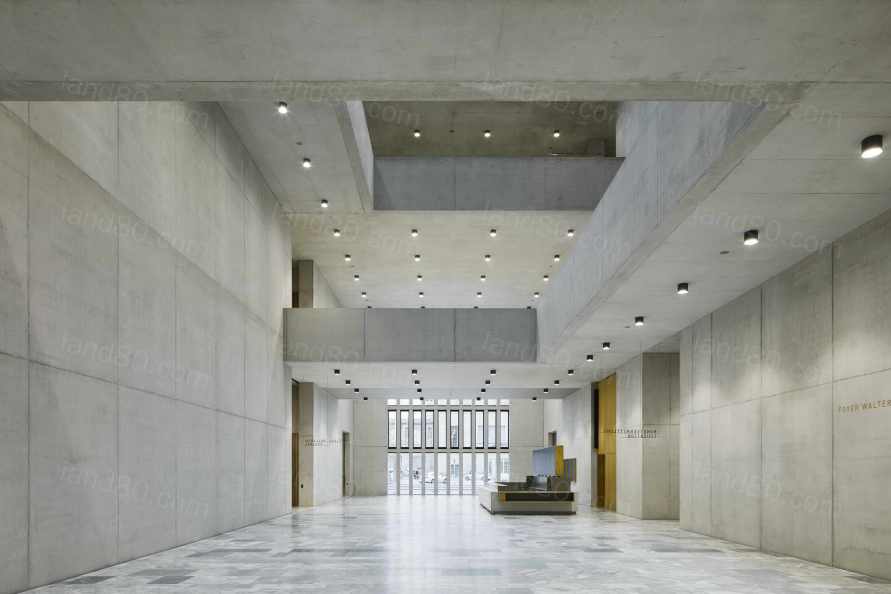
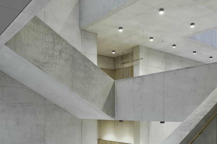
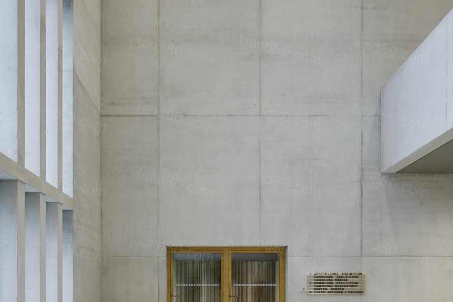
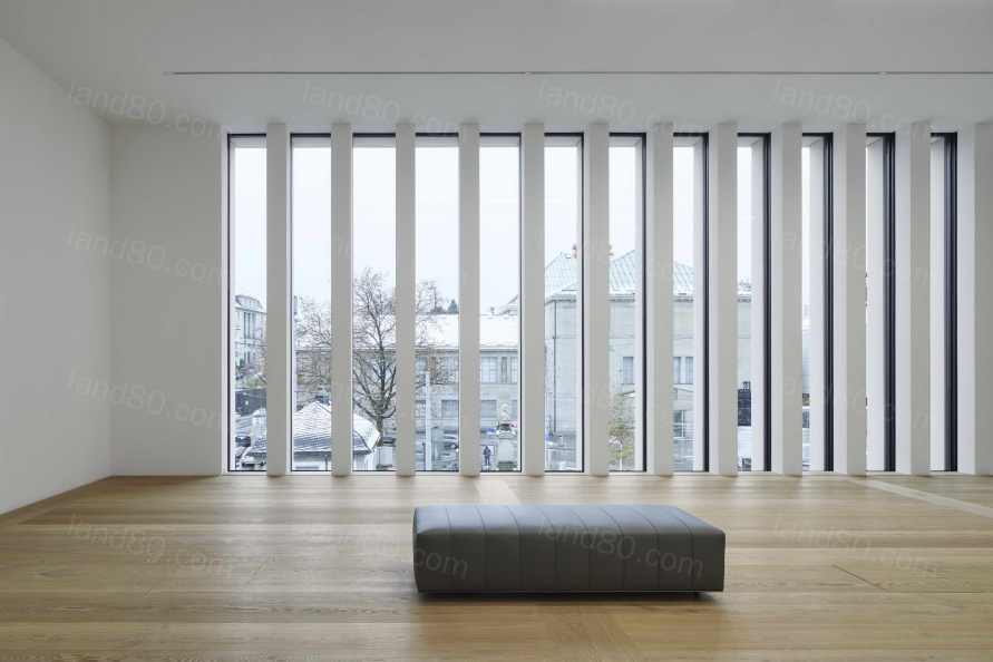
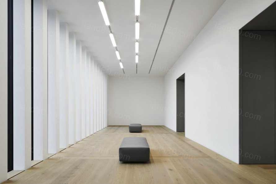
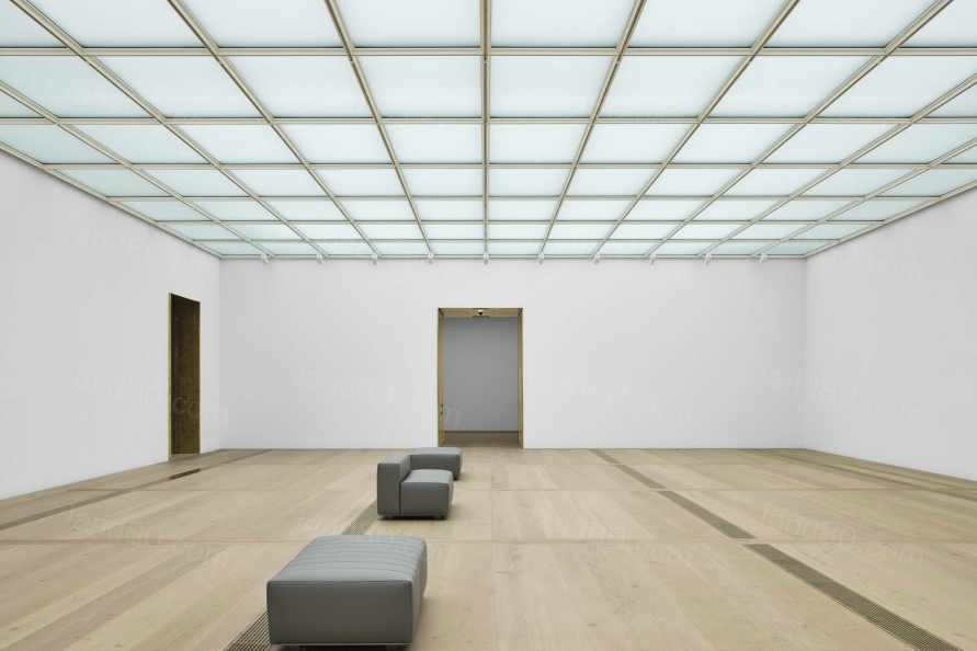
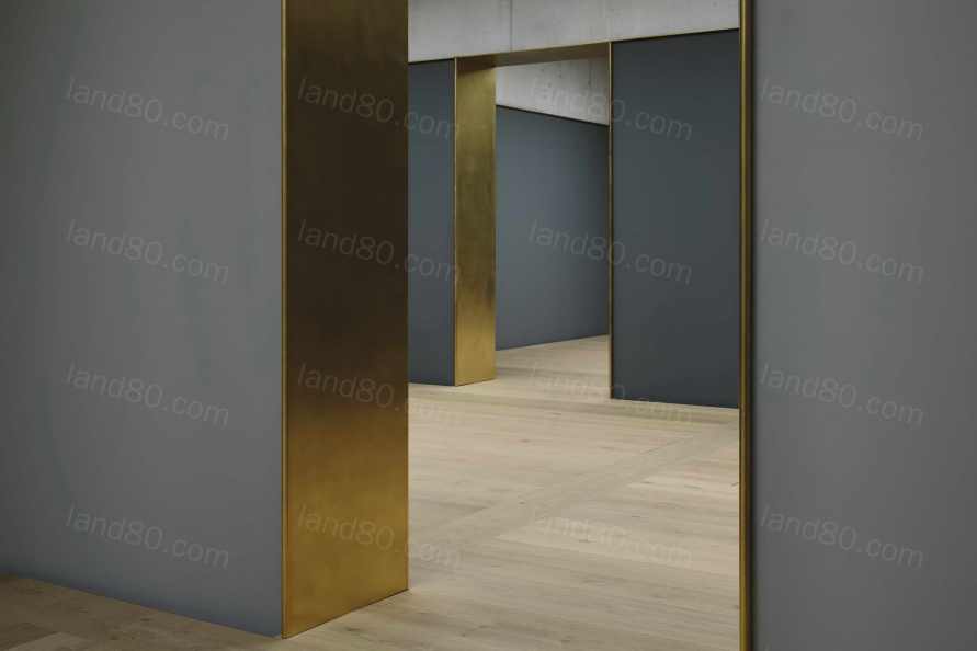
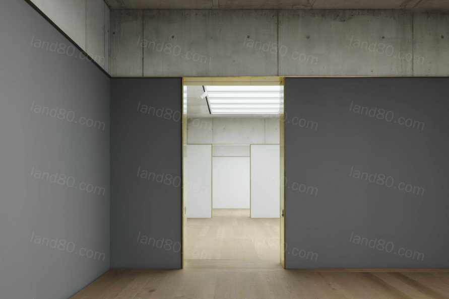
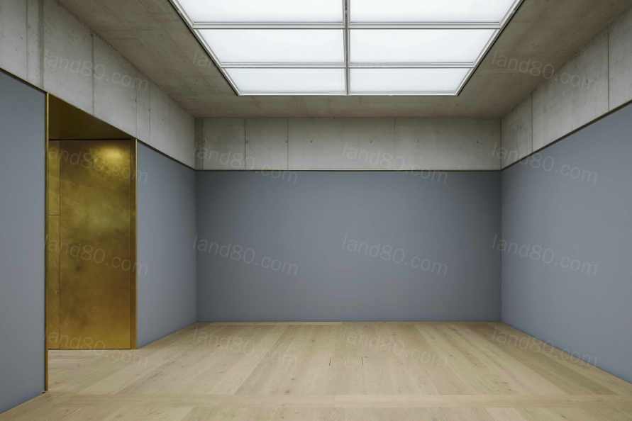
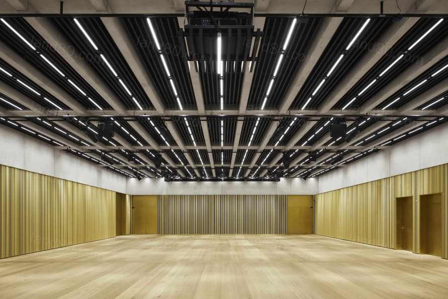
内部组织是基于 "房间的房子 "的概念。这一理念体现在房间的大小、方向、材料和照明等方面的不同设计上,使每个房间都有自己的特点,并创造出多样化的空间序列。所有的公共功能,如咖啡馆/酒吧、活动大厅、博物馆商店和博物馆教育服务都围绕着底层的中央入口大厅布置,而上面两层则专门用于展示艺术。不同尺寸的展览空间的特点是平静的材料和丰富的日光,一楼的侧光和二楼的天窗将艺术的直接体验置于参观者体验的中心。
The internal organisation is based on the concept of a ‘house of rooms’. This idea finds its expression in the different design of the rooms in terms of size, orientation, materiality and lighting, giving each its own character and creating a diverse sequence of spaces. All public functions such as the café/bar, events hall, museum shop and museum education services are arranged around the central entrance hall at ground floor level, while the two upper floors are reserved exclusively for the display of art. The varyingly dimensioned exhibition spaces are characterised by a calm materiality and an abundance of daylight – side light on the first floor and skylight openings on the second floor – placing the immediate experience of art at the centre of the visitor experience.
Project: Kunsthaus Zürich
Architect: David Chipperfield Architects Berlin
Competition: 2008
Project start: 2009
Completion due: 2020
Gross floor area: 23,300m2
Client: Einfache Gesellschaft Kunsthaus Erweiterung – EGKE
Project architects: Hans Krause (Competition, Concept design), Barbara Koller (Schematic design, Design development, Technical design), Jan Parth (Technical design, Site design supervision), Markus Bauer (Deputy project architect, 2009–2014), Robert Westphal (Deputy project architect, 2015–2020)
Project team: Wolfgang Baumeister, Leander Bulst, Beate Dauth, Kristen Finke, Pavel Frank, Anne Hengst, Ludwig Jahn, Frithjof Kahl, Guido Kappius, Jan-Philipp Neuer, Mariska Rohde, Diana Schaffrannek, Eva-Maria Stadelmann, Marc Warrington; Graphics, Visualisation: Konrad Basan, Dalia Liksaite, Maude Orban, Ken Polster, Antonia Schlegel, Simon Wiesmaier, Ute Zscharnt
Competition team: Ivan Dimitrov, Kristen Finke, Annette Flohrschütz, Pavel Frank, Gesche Gerber, Peter von Matuschka, Sebastian von Oppen, Mariska Rohde, Franziska Rusch, Lilli Scherner, Lani Tran Duc, Marc Warrington; Graphics, Visualisation: Dalia Liksaite, Antonia Schlegel, Ute Zscharnt In collaboration with
Executive architect: b+p baurealisation ag, Zurich (Procurement, Construction supervision), Project architects: David Michel, Christian Gruober
Overall management: Niels Hochuli, Dreicon AG, Zurich
Structural engineer: IGB Ingenieurgruppe Bauen, Karlsruhe dsp-Ingenieure & Planer AG, Greifensee Ingenieurgemeinschaft Kunsthauserweiterung, Zurich
Services engineer: Polke, Ziege, von Moos AG, Zurich Hefti. Hess. Martignoni. Holding AG, Aarau
Building physics: Kopitsis Bauphysik AG, Wohlen
Fire consultant: Gruner AG, Basel ContiSwiss, Zurich
Façade consultant: Emmer Pfenninger Partner AG, Munchenstein
Lighting consultant: matí AG Lichtgestaltung, Adliswil (Artificial light) Institut für Tageslichttechnik, Stuttgart (Daylight)
Signage: L2M3 Kommunikationsdesign GmbH, Stuttgart
Landscape architect: Wirtz International nv, Schoten KOLB Landschaftsarchitektur GmbH, Zurich
Photo credit: Noshe KOSTENFREI
|