2011年,Barozzi Veiga在瑞士Lausanne新艺术区的总体规划设计国际竞赛中获胜,随后设计并建造了Lausanne州立美术博物馆。作为城市策略中的一部分,项目实现了一个新的结构空间,一个新的博物馆围绕的公共广场。空间沿着场地延伸,与现有的火车站广场相连,构成了一个新的连续的主要公共空间。新建筑成为城市生活的框架和Lausanne新公共艺术中心的容器。
In 2011 Barozzi Veiga won the international competition for the definition of a masterplan for the new Art District in Lausanne, Switzerland – Platform 10 – and subsequently designed and built the Musée cantonal des Beaux-Arts Lausanne. As an urban strategy, the masterplan implements a new structuring void, a public square around which the new museums gravitate. The void stretches along the site and, being connected to the existing train station’s square, it constitutes a new continuous main public space. The new architectures become the frame of the urban life of the city and the containers of the new public art centre of Lausanne.
▽项目外观 Exterior
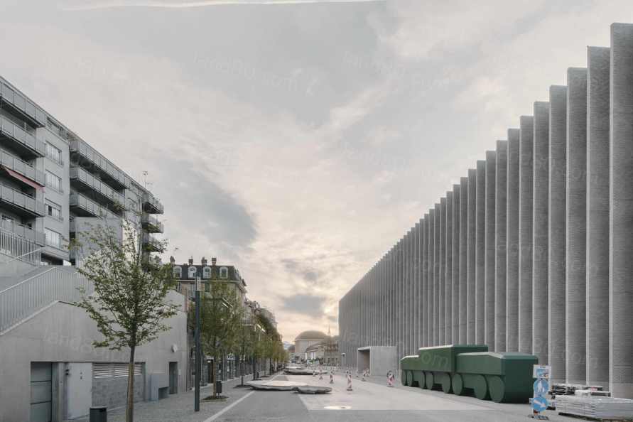
▽项目外观 Exterior
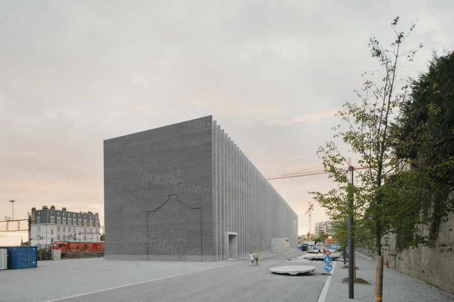
▽项目外观 Exterior
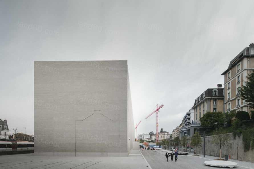
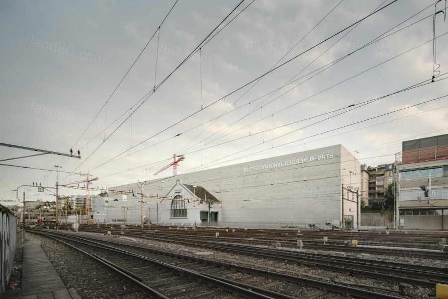
项目位于场地的最南边,是一个纵向的单体量建筑,与铁轨平行,定义了城市空间的同时也保护了城市空间免受火车的骚扰。在这种情况下,项目承载并表达了场地的记忆,以务实的形式、严谨的几何学和硬朗的线条呼应了以前的工业状态。此外,通过对特定片段的保留,实现对场所的记忆。设计保留了部分原有的大厅,并将其改造为项目的核心部分。旧的拱形窗从铁路上成为建筑立面的主角,一旦进入门厅,它就会显示出其作为新建筑空间序列的实质性结构组成部分的全部作用。
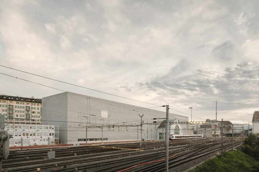
The Musée cantonal des Beaux-Arts Lausanne takes place on the southern edge as a longitudinal monolithic volume, parallel to the rails, defining the urban space while protecting it from the trains’ nuisances. Embracing this condition, the project carries and expresses the memory of the site, echoing the former industrial condition with pragmatic forms, rigorous geometry and hard, sharp lines. Moreover, the memory of the place is achieved through the preservation of specific fragments. The design preserves part of the original hall and transforms it as a central piece of the project. The old arched window becomes the main protagonist of the building façade from the railway and, once within the foyer, it reveals its full role as a substantial structuring component of the new building’s sequence of spaces.
▽临近铁轨的纵向单体体量 the longitudinal monolithic volume near the rails
博物馆分为三层,由门厅的连续空间开始连接了功能与流线。底层作为公共广场的延伸,容纳了咖啡馆、书店、礼堂等主要公共项目。底层的立面有许多小孔的,以便使这些内部功能与广场外部的公共空间保持连续性。
The museum is organized on three floors connected by the continuous void of the foyer that structures the circulation and the program. The ground floor developed as the extension of the public square and shelters the main public programs such as the café, the bookshop, the auditorium etc. The façade on that level is very porous in order to allow for these internal functions to be in continuity with the exterior public space of the square.
▽门厅作为公共广场的延伸 ground floor developed as the extension of the public square
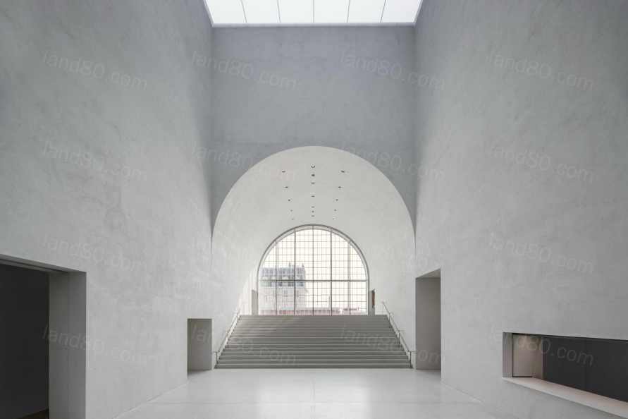
▽门厅作为公共广场的延伸 ground floor developed as the extension of the public square
在较高的楼层,在大厅的两侧,是展览空间。东边的永久画廊和西边的临时画廊是分开的。它们可以通过单独的连续游览或并行游览来参观,由于独立的垂直流线,使得未来的综合展览和小型收藏展览成为可能。
On the higher levels, on both sides of the foyer, take place the exhibition spaces. The permanent gallery to the east is separated from the temporary gallery to the west. They can be visited with a single continuous tour or in parallel tours, thanks to independent vertical circulations which allow future comprehensive exhibitions as well as smaller capsule collections.
▽展览空间 the exhibition spaces
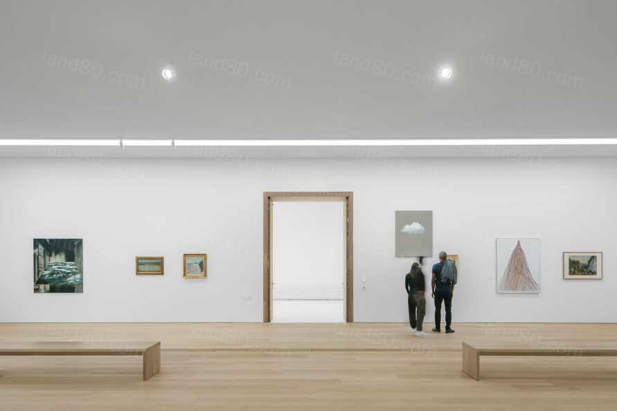
上层的自然采光通过北向的模块化顶棚获得,旨在过滤和调整太阳光。顶棚有一个内置的百叶窗系统,可以细致地控制进入房间的光线量,也可以为室内提供一个昏暗的环境,为艺术作品提供最佳的光线条件。
The upper floor is naturally lit up through north oriented modular sheds, designed to filter and adjust the solar light. These sheds have an internal system of blinds to allow a meticulous control of the amount of light entering the rooms as well as the possibility of a dimmed atmosphere to offer optimal conditions for the art pieces.
▽可调节的顶棚获得自然采光 the oriented modular sheds
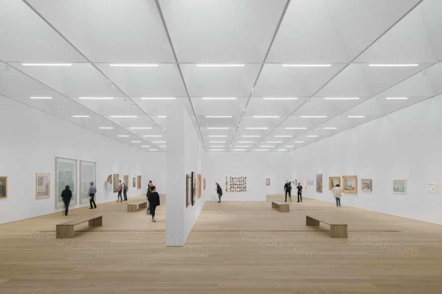
▽可调节的顶棚获得自然采光 the oriented modular sheds
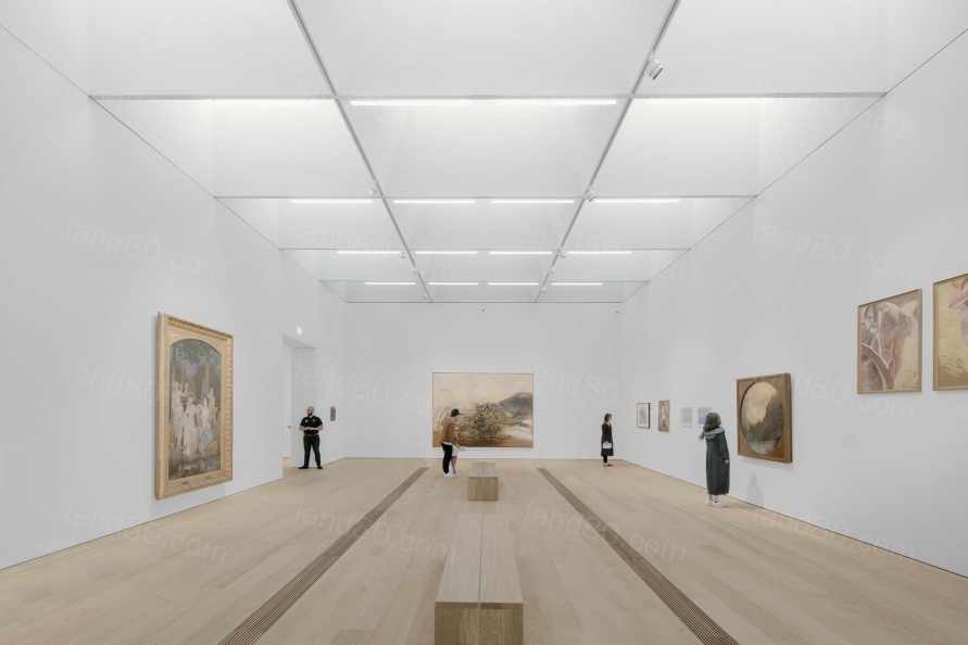
面向铁路一侧的南立面是是一个封闭、内敛的立面,这是为了保护藏品,而北立面朝向公共空间的立面则更加开放、通透和活跃。
The overall building façade is relatively hermetic. In order to protect the collections, the museum has a closed, introverted façade to the railway side, to the south. A more open, permeable and animated façade characterizes the north elevation, towards the public space.
▽临近铁路的封闭立面 the hermetic south facade
▽北向的开放立面 the open facade to the north
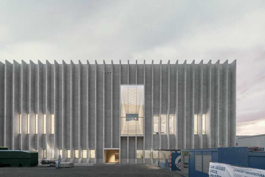
砖立面唤起了场地的工业历史记忆,并为单体提供了一种质感和充满活力的图案。在广场上,垂直百叶窗的节奏打破了巨石体量,指引着人们走向入口。在夜晚,这些百叶窗作为画布,漫射出博物馆内部的光线。
The brick façades evoke the industrial history of the site and offer a texture, a vibrant pattern to the monolith. On the square, the vertical blinds’ rhythm breaks the massiveness of the monolith and reveal the openings. At night, these blinds serve as a canvas to diffuse the interior light coming from the museum.
▽入口与立面的韵律 the entrance and the vertical blinds’ rhythm
▽夜晚,立面漫射出温暖的光 the facade diffuse the interior light coming from the museum
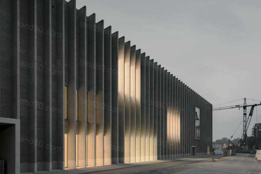
2019年4月5日,项目正式交付沃州,并于2019年10月5日举办了第一次展览。
On the 5th of April 2019 the keys of the MCBA Lausanne were officially delivered to the Canton of Vaud. The museum opened its first exhibition on the 5th of October, 2019.
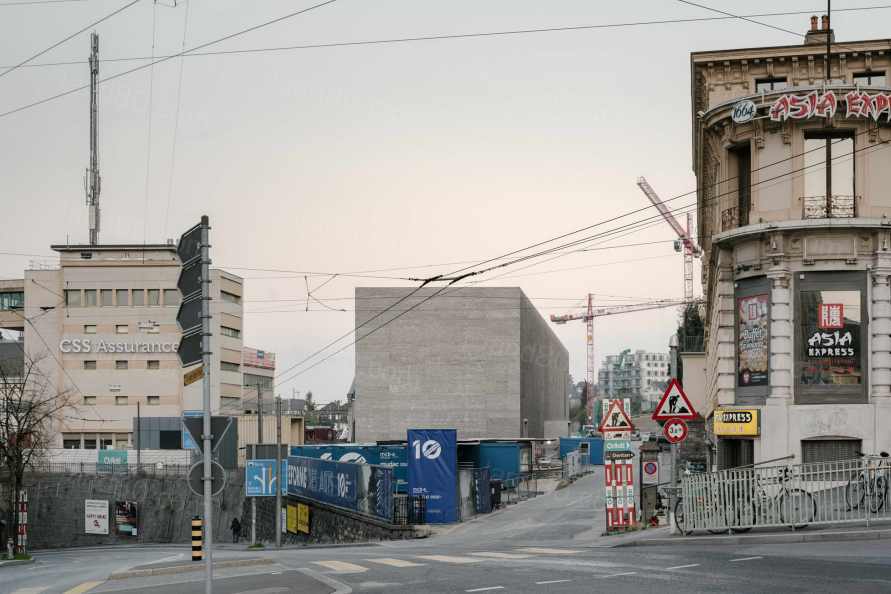
Project: Musée cantonal des Beaux-Arts Lausanne
Design Firm: Barozzi Veiga
Address: Place de la Gare 16, 1003 Lausanne, Switzerland
Client: Canton de Vaud Direction générale des immeubles et du patrimoine Architecture et Ingénierie cantonale (DGIP)
Address: Place de la Riponne 10 1014 Lausanne Switzerland
Floor area: 6895m2
Built-up area: 12449 m2
Volume: 82536.94 m3
Start of planning: 2011
Start of construction: 2016
Completion: 2019
Total cost: 84 500 000 CHF (building: 64 715 000 CHF) Cost per m2 6 626.91 CHF/m2
Building contractor: Specific constructor for different construction elements
Planning: Barozzi Veiga
Project manager: Pragma Partenaires SA
Project team execution phase: Pieter Janssens, Claire Afarian, Alicia Borchardt, Paola Calcavecchia, Marta Grządziel, Isabel Labrador, Miguel Pereira Vinagre, Cristina Porta, Laura Rodriguez, Arnau Sastre, Maria Ubach, Cecilia Vielba, Nelly Vitiello, Alessandro Lussignoli
Project team competition phase: Roi Carrera, Shin Hye Kwang, Eleonora Maccari, Verena Recla, Agnieszka Samsel, Agnieszka Suchocka
Structural consultant: Ingeni SA
Photo Credit: Simon Menges
|