客户的愿望是在这个从停车场划出的双高小空间里,为他的项目提供一个额外的的作为图书馆的空间。客户的愿景,他的良好意图和预算限制,是我们设计的主要因素。我们的工作内容是解决空间属性,创建一个多功能的阅读空间。我们希望这个空间对成年人和孩子都同样有趣。如今,网络上有如此多的各式各样的信息,以至于通过阅读书籍来获得深入知识的习惯正在消失。因此,促进阅读和分享知识的想法被视为我们设计思维的一个整体。而且,我们努力调整预算,为成人和孩子创造一个多功能的学习空间。
The client’s aspiration was to provide a library as an additional amenity for his project in this small double height space carved out of the parking lot. The client’s vision, his good intent and the budgetary constraints became the under lining factors for our line of thought. Our effort was to address the spatial attributes and create a multi-functional reading space. We wanted this space to be equally interesting for adults as well as kids. These days there is so much assorted data online that the habbit of reading from books to gain indepth knowledge is getting extinct. Thus, the idea of promoting reading and sharing knowledge was seen as an integral aspect of our design thinking. Efforts were taken to optimize expenses and create a multi utility learning space for adults and kids.
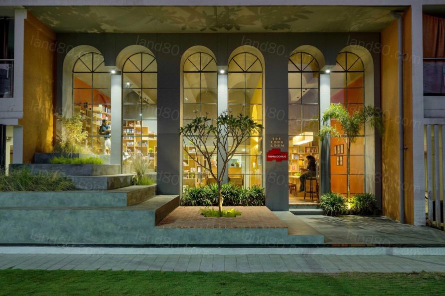

拱形的天花板和拱形的外立面帮助我们定义了空间体量的变化。由于这个空间只有一面可以获得自然光线,我们必须充分利用这一点,并将所需的光线引入室内空间。一个阶梯型的圆形剧场,在一侧提供非正式的座位,以帮助这个空间以多种不同的方式灵活使用。另一端的社区阅读桌设计用于与不同使用它的人同时进行交互和知识交流。
Vaulted ceiling & arched external facade helped us in defining the volumetric modifications. Since, only one side of this space could get natural light, we had to make best use of this and draw in required amount of light into the interior space.A stepped amphitheater kind of informal seating on one side is proposed to help this space have the flexibility to be used in many different ways. A community reading table on the other end is designed to enable interactions & exchange of knowledge with different people using it at the same time.
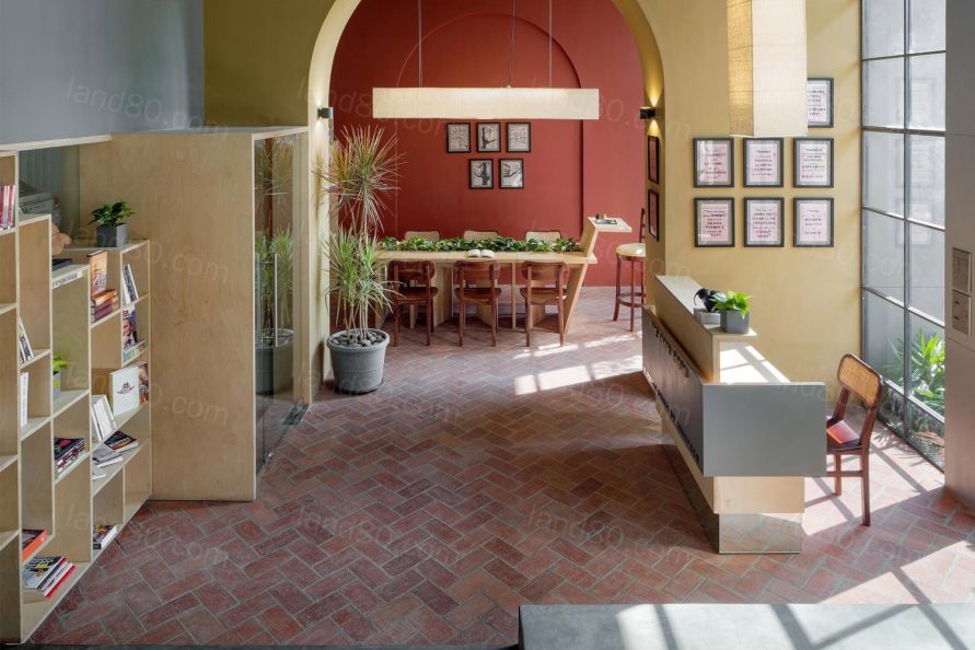


在空间、预算和空间性质的限制范围下,我们有意识地尝试在环境负责的方面进行设计。这个空间不依赖于机械通风,东西方向的交叉自然通风达到了通风的目的。而且由于全高度的玻璃幕墙,整天室内空间充满了自然光,减少了白天大部分时间的人造光的使用。
Within the set constraints of space, budget & nature of work, we have consciously tried to work on aspects for an environmentally responsible design approach. The space does not rely upon mechanical ventilation. East – West cross ventilation serves the purpose. Due to the full height glass facade, interior space is flooded with natural day light till late evening, reducing use of artificial lights for major part of the day.

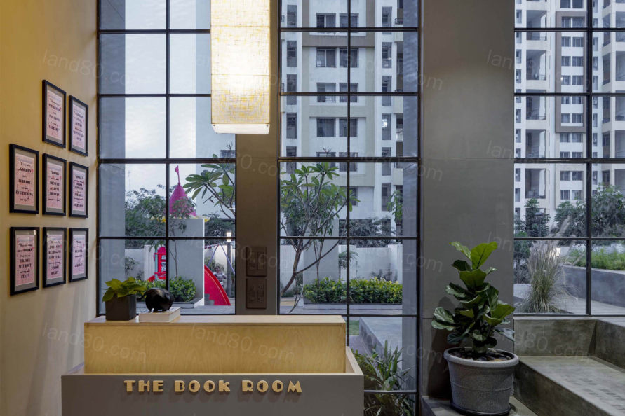
材料面板由当地可用的砖、混凝土和绿色胶合板组成,有助于控制材料的使用。细化和模块进一步帮助资源的整体优化和减少浪费。色彩和纹理保持在一种更朴实的色调上,只是为了让这个空间更人性化,远离这种活动典型的正式设置。自然植物在室内和室外都得到了广泛的应用。它们被整合在书架、阅读桌、座椅和景观空间中,意图在空间中营造一种舒缓的效果,摆脱长家具的单调。
A material palette comprising of locally available brick, concrete and green rated plywood helped in a controlled usage of materials. Detailing & modules further helped in the overall optimization of resources & reduction in wastage.Colours and textures are kept on an earthier tone simply to make this space more humane & move away from the typical formal setup of such activities. Natural plants have been used thru ‘out the indoors and outdoors. They are integrated within book shelves, reading tables, seating and landscape pockets, with an intention to cast a soothing effect into the spaces & break away from the monotony of long furniture pieces.
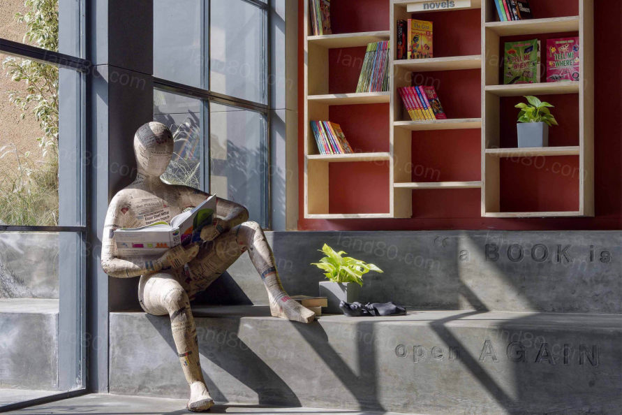
最后,每一个细节和设计输入都是为了让空间更人性化,让阅读成为一段快乐的时光,分享知识成为互动的理由!
Lastly, each detail and design input is focused on making the space more user friendly, so that reading becomes a happy time and sharing knowledge becomes a reason for interaction...!!


▼项目平面图 Plan

▼项目剖面图 Section
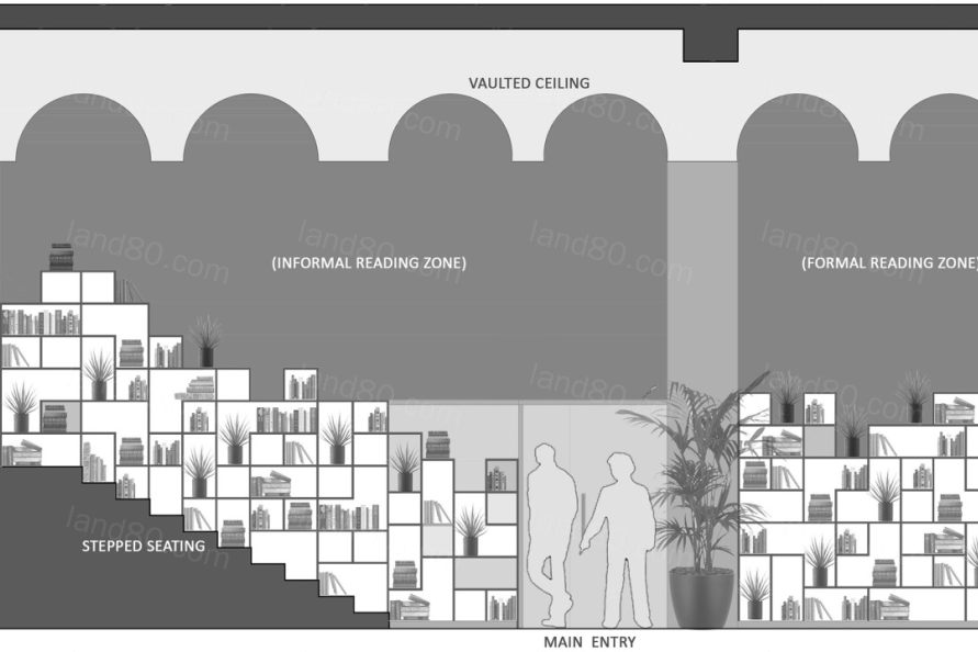
▼项目立面图 Elevation

Project name: The Book Room
Design Firm: Studio Infinity
Website: www.studioinfinity.in
Contact e-mail: projects@studioinfinity.in
Instagram Handle: https://www.instagram.com/studio_infinity_pune
Facebook Page: https://www.facebook.com/Studio-Infinity
Project location: Pune (MH), India
Completion Year: 2020
Building area (m2): Indoors: 525 sq.ft. + Outdoors: 415 sq.ft.
Principal Designers: Tushar Kothawade &ChiranjiviLunkad
Design Team: Prakash Suthar, Pallavi R &RashmiShewale.
Client: AshwinTrimal, Truspace.
Project Head: Mahesh Talekar
Contractors: Prima Domus Execution Team.
Photo credits: Hemant Patil
|