业主的愿望是将自己的老房子进行改造,以满足其使用性,并为其生活和工作创造灵感,业主作为设计师和从事时尚事业的服装品牌的所有者,其生活方式也具有欢快和现代感。设计师将各种优势运用到设计中去,在房子里面打造出满足各种需求的室内空间。
The owners ‘desire is to renovate their old house to response the usability and create an inspiration both of their living and working.As a designer and the owner of the clothing brand who work in a fashion career make their lifestyle also have a jolliness and modern. The designer then takes the various strengths to apply in the design and create an interior inside the house to meet the various needs.
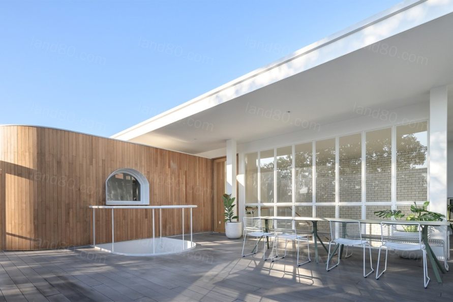
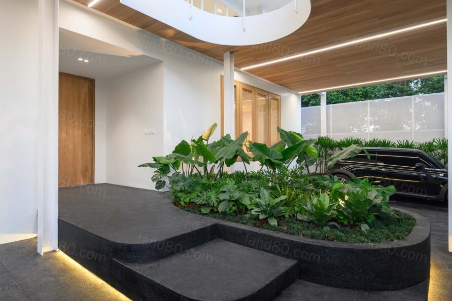
第一步是收集原有建筑的细节,寻找原有空间的问题,合理的规划可以提高空间的使用效率。原有区域的使用性不一致,从房屋的主入口开始,功能布局也都有欠缺,超出了住户的需求,包括结构的定位,造成了废旧空间的困难。设计师计划将新的空间连接起来,解决原有结构造成的浪费空间的问题,在保留部分原有建筑框架的前提下,将不透气的空间改变为比较开放的空间。
The first step is to collect the details of the original building and looking for the cause of the original spaces that there is any capacity to increase an efficiency of how to use the space. The original area is not consistent with the usability, from the main entrance of the house, the functional layout are also lacking and exceeding the needs of the residents including the positioning of the structures that cause the difficulty of the waste spaces. The designer plans to connect the new spaces and solve the problem of the waste space that causes by the original structure. To change the airless spaces into the space that can stimulus to the residents while keeping some of the original building frame.
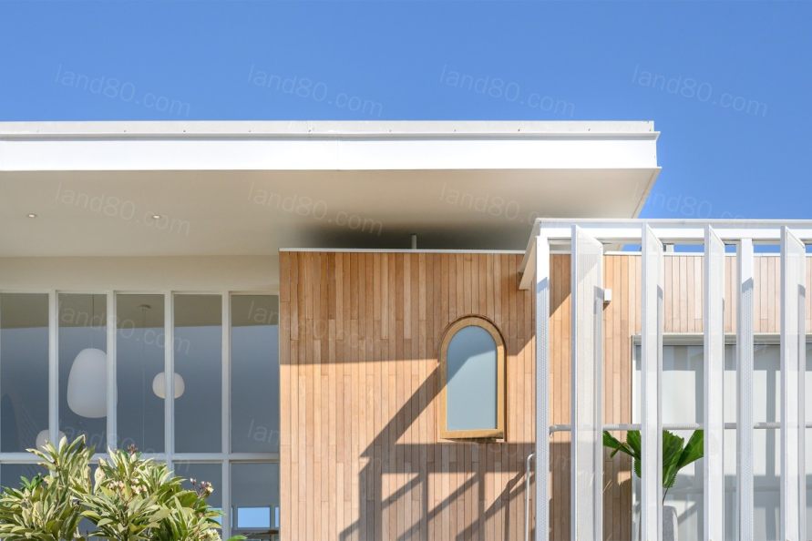
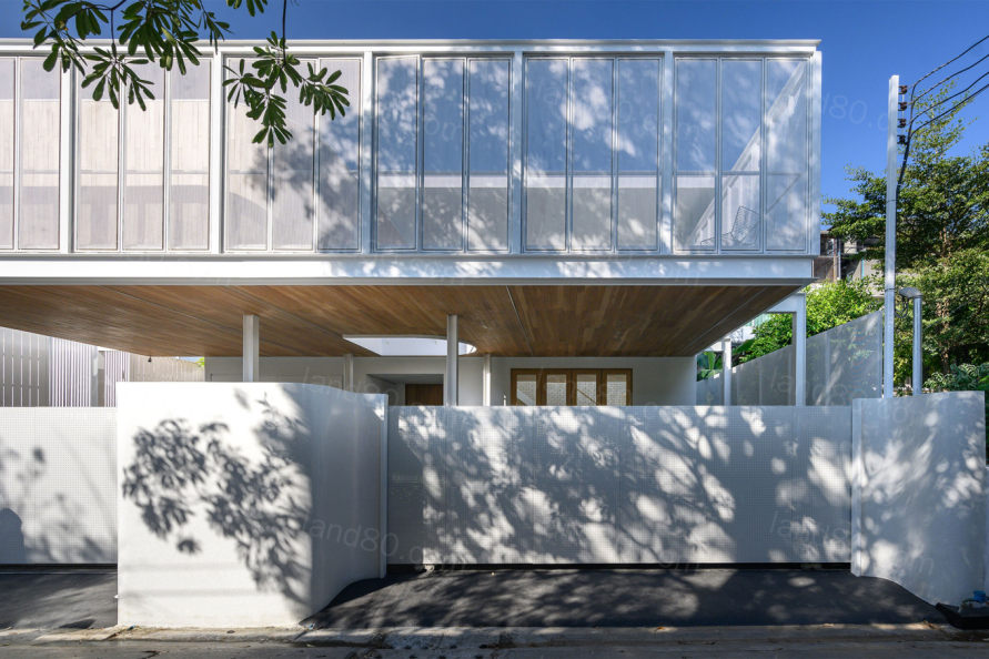
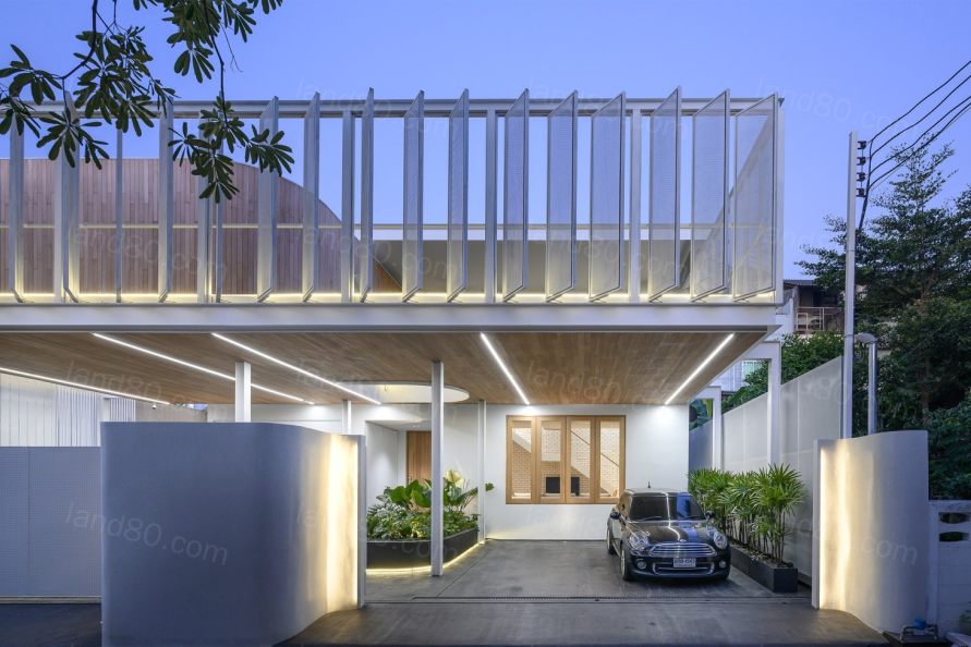
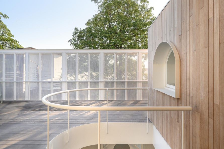
建筑的特点是房子前面被外立面覆盖的露台,感觉像漂浮在空中。设计师选择了半透明的外墙来覆盖二楼的前廊,而前廊原本是车库的屋顶,设计师从增加新功能的需要出发,增加了突出阳台区域的形状。从外面看,半透明外墙覆盖着几何木层。
The distinctive feature of the building is the terrace that is covered by the facade in front of the house which feels like floating . The designer chose Translucent Facade to cover the front porch on the 2nd floor which originally was the garage’s roof and increase the shape that start up from the need of adding a new function to protrude into the balcony area. When looking from the outside, the Translucent Facade is covered with a geometric wood layer.
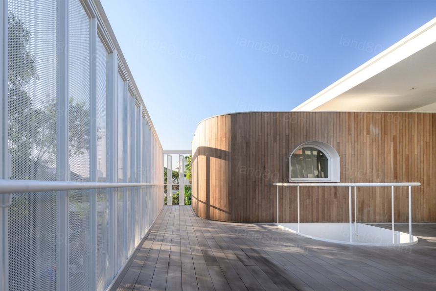
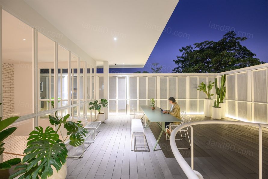
这种半透明的外墙改变了原有建筑的外观,使其看起来更加现代,创造了一个新的区域,也有助于增加居民的隐私,通过设计,外墙可以打开和关闭,当关闭所有的窗户时,它将是透明的,从外面只可以看到一点内部空间,当想要室内区域通风并与外部环境相连时,可以打开外墙。住户可以根据自己的使用情况,根据空间的使用要求进行设计。当有光影的时候,这种白色的透光幕墙也会在每一天创造出不同的光影之美。
This Translucent facade changed the look of the original building to look more modern, creating a new area also help to increase the privacy of the residents by designing the facade to be able to open and close. When closing all the windows it will be transparent. From the outside is allowed to see a little movement inside the house. When wanting the inside areas to be airy and connected to the outside ‘s environment, the facade can be opened. The residents can design on their own usage, according to thespace usage requirements. When there’re light and shade, this white Translucent facade will also create several beauty in each day.
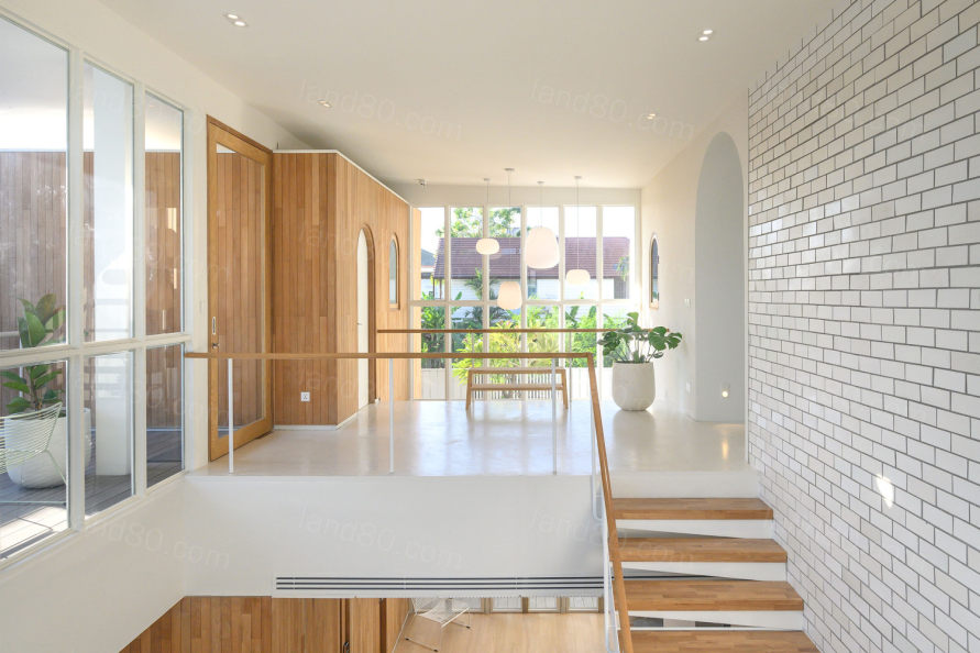
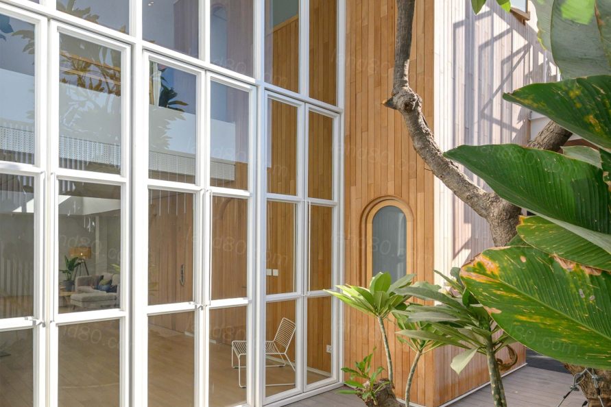
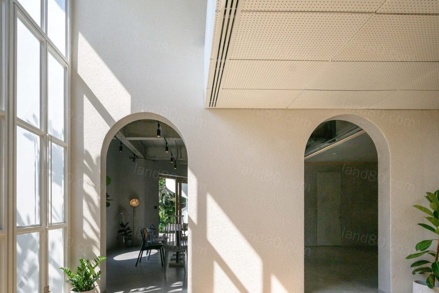
内部空间的主要设计理念是将业主的个性和生活方式融入设计中,曲线的元素软化了刚硬的线条,让空间看起来更柔软。设计师在建筑的两侧和平面上使用了曲线,在设计和材料的选择上增加了更多的多样性,满足了不同的需求,但仍然使整体的想法是一致的。例如,娱乐室内部被设计成L形的两排。窗帘被用作隔断,在这些区域之间可以灵活地开启和关闭。此外,设计师还在灯光上添加了一点小元素,可以在晚上改变该区域的颜色。
The inside spaces have a main concept of taking the personality and lifestyle of the owners into the design. Therefore, curves are used to soften the hard shape to look softer. The designer used curves in both side and floor plan of the building, added more variety to the design and the material’s selection to meet various needs but still make the overall to be in the same idea. For instance, inside the recreational room was designed to have 2 rows in L shape. The curtains are used to be as a partition that is flexible in opening and closing between these areas. Moreover, the designer also added a little gimmick with the light that can change the color to the area at night.



因此,这座房子绝对能满足不同维度的需求。
So, this house is a house that absolutely responses the needs of the various dimension.
Project Name: With.It Home
Design Firm: BodinChapa Architects
Website: www.bodinchapa.com
Face Book: www.facebook.com/BodinChapaArchitects
Instagram: bodinchapa_architects
E-mail :bdcaarchitects@gmail.com
Building Type: House
Location: Bangkok, Thailand
Completion: 2019
Interior Designer: BodinChapa Architects
Landscape Designer: BodinChapa Architects
Structural Engineer: Papop Mora
Contractor: WeeravitLuengteeranart
Building Area: 360 SQ.M.
Photo Credit: Rungkit Charoenwat
|