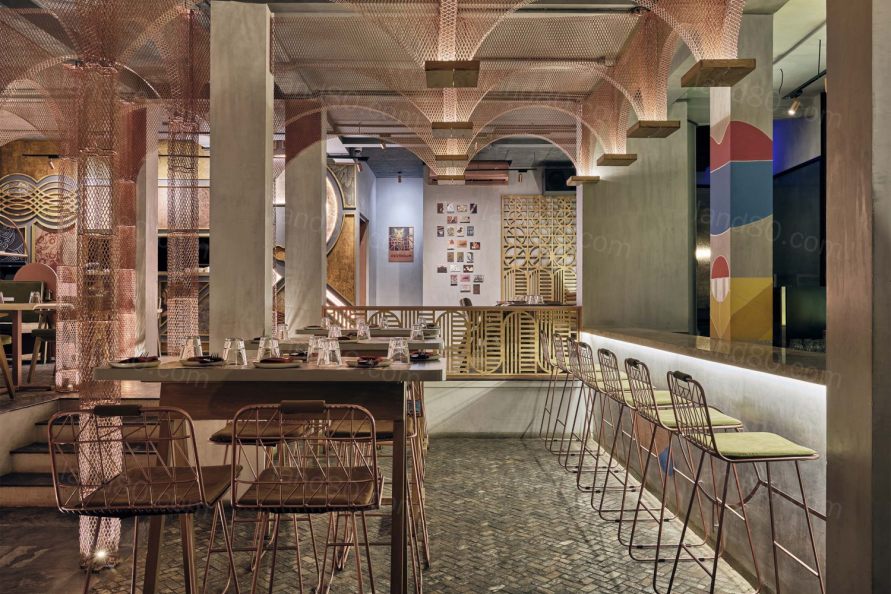
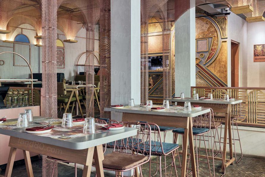
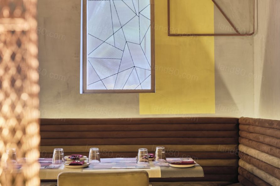
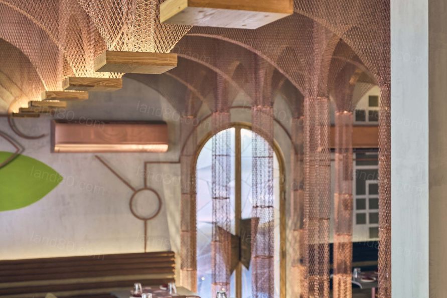
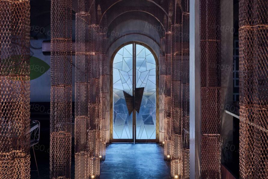
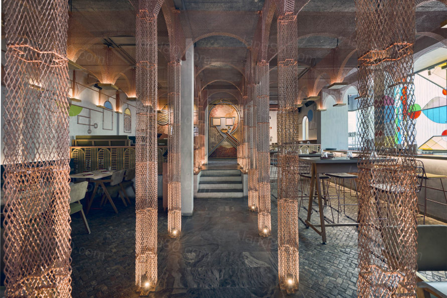
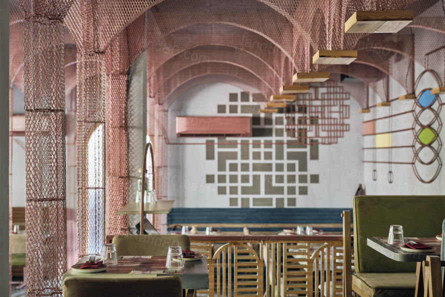
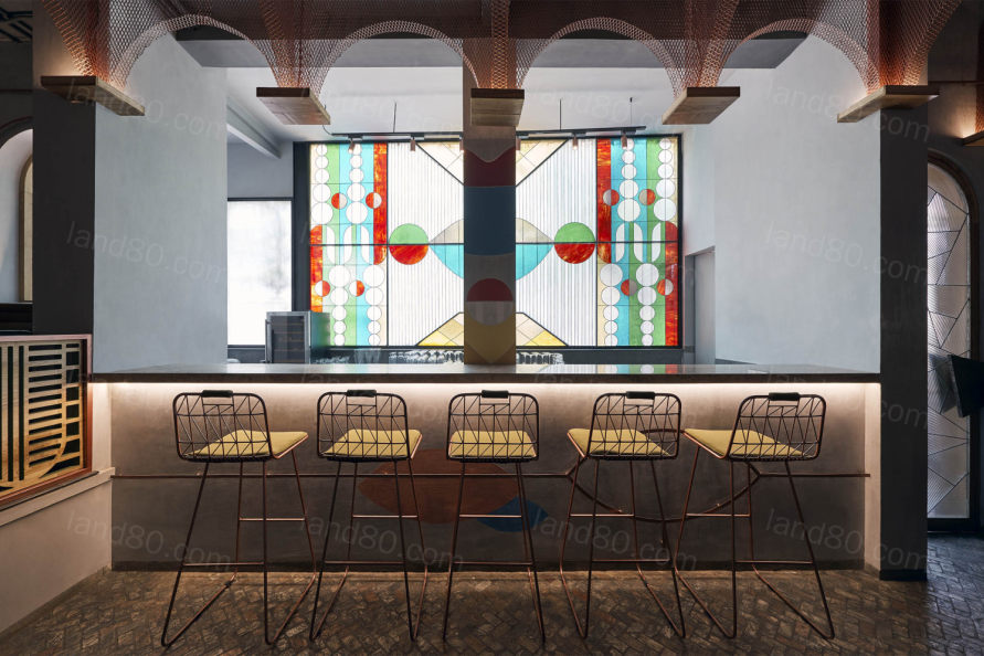
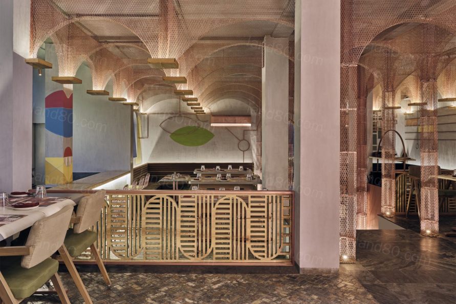
想象一下,在任何教堂的建筑工地里都有这样一家亚洲餐厅;想象一下,当你走在中央小岛上,看着正在建造的圣坛,你会欣赏到身边和上方金属柱子和拱门的支撑;想象一下侧面的染色玻璃在阳光下流淌,想象一下墙上的手绘壁画。
Imagine an Asian restaurant inside a construction site at any chapel. Imagine walking down the central isle looking at an alter in the making as you appreciate the support of the metal columns and arches alongside and above you. Imagine the stain glass on the sides streaming in the sunlight and imagine hand-painted murals on walls.
©Gokul Rao Kadam
©Gokul Rao Kadam
©Gokul Rao Kadam
©Gokul Rao Kadam
©Gokul Rao Kadam
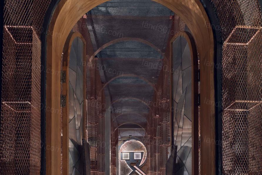
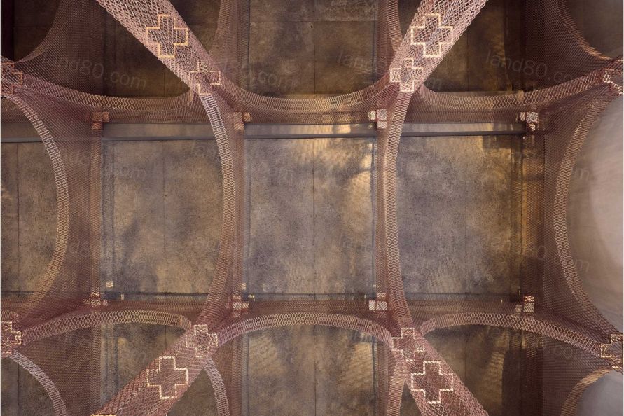
当我们进入场地,看到一座有拱门的老建筑时,我们立刻知道我们将把老建筑的结构留在新建筑内。由于这是我们正在设计的第二个MISU,因此我们制定了一些基本规则:我们将像第一个MISU一样使用深蓝色、绿色、芥末和深红色,并以某种方式使用铜。剩下的部分都是空白的,就像一张画布一样,空间的设计帮助实现了这个空间,被一个中心通道分割,留下一个相当大的台阶,因此这个区域会有一个较低层高。
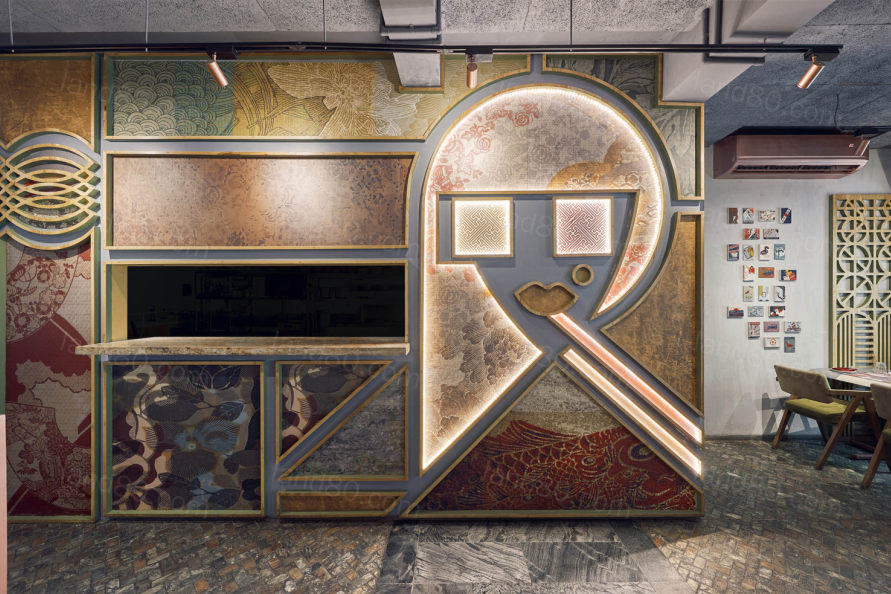
When we saw the site, an old building with arches, we knew at once we wanted to take some of the structural remnants inside as well. Since this was the second Misu we were designing, we also wanted it to have a bit of familiarity from the first one for brand recall. So we laid out some ground rules – we would bring back all our deep colours of blue, green and mustard and crimson, and use copper in some way as the first Misu too had in in abundance. And of course, the client maintained that he would like a face of sorts to be present as that worked in the first restaurant. The rest of it was as blank as a canvas could be. The space planning helped in realizing that this space, like the first would be divided by a central passage. There would be a fairly large step up and this area would have a lower ceiling.
©Gokul Rao Kadam
©Gokul Rao Kadam
©Gokul Rao Kadam
©Gokul Rao Kadam
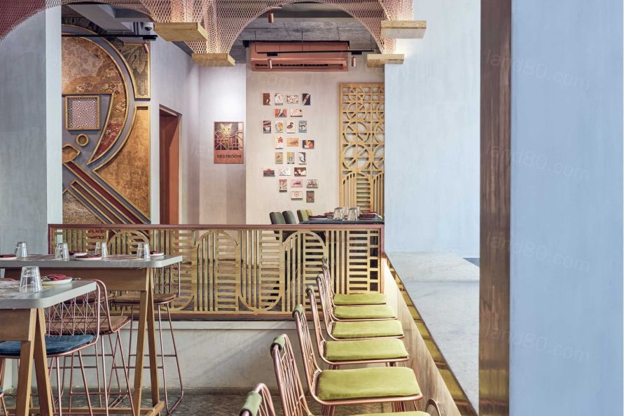
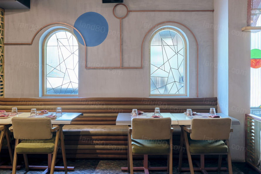
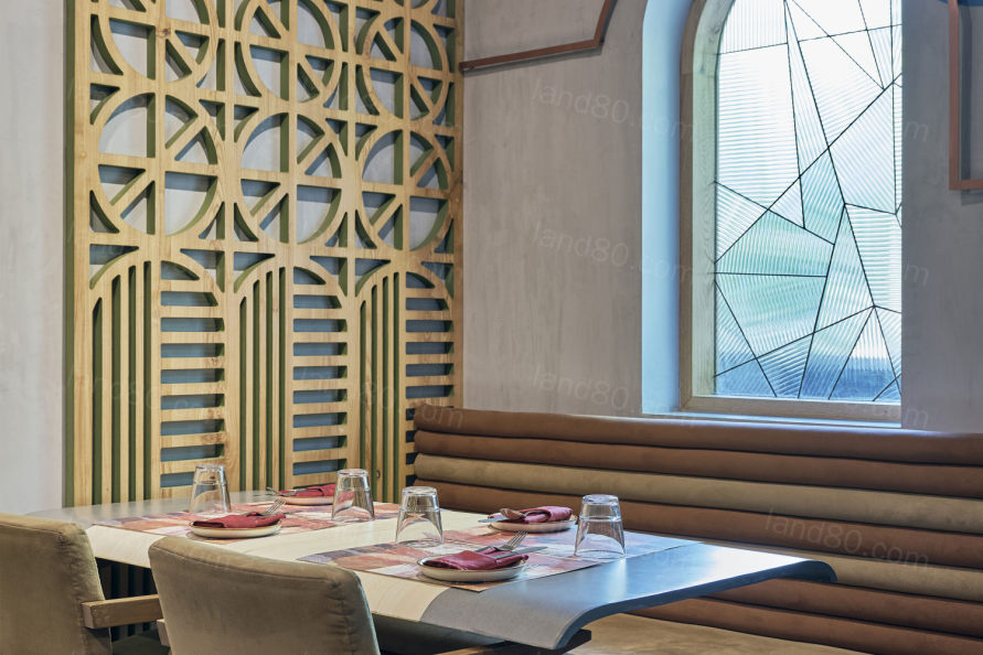
亚洲餐厅往往有带有浓重的亚洲特色,这是顺应潮流的。但我们的项目不是,它是抽象的,使用许多线条和形状元素,打破了亚洲餐厅必须看起来像典型的“亚洲”的趋势,用竹子、绿色植物、甘蔗和天然材料、亚洲象征和字体等元素。当你看到一家亚洲餐厅时,通常你可以从一英里外就能认出它。在这一点上,我们使用了罗马教堂的元素,如染色玻璃,壁画和中央小岛,创造了一种违反直觉的亚洲餐厅感觉。
It stays to a trend that Asian restaurant often have an Asian face that is larger than life. But also it breaks away by the way the face is done. It is abstract using lines and shapes. The setting itself breaks away from the trend that Asian restaurant have to look typically “Asian” with elements like bamboo, greenery, cane, and natural materials, Asian symbolism and typography. When you see an Asian restaurant, usually you can spot it from a mile away. With this, we used Roman church elements like stain glass, wall painting and a central isle to create a counterintuitive feel for an Asian restaurant.
©Gokul Rao Kadam
©Gokul Rao Kadam
©Gokul Rao Kadam
©Gokul Rao Kadam
©Gokul Rao Kadam
©Gokul Rao Kadam
▼项目平面图
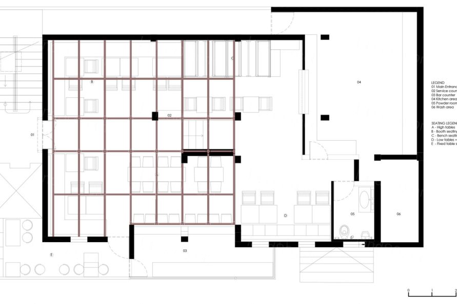
▼项目剖面图
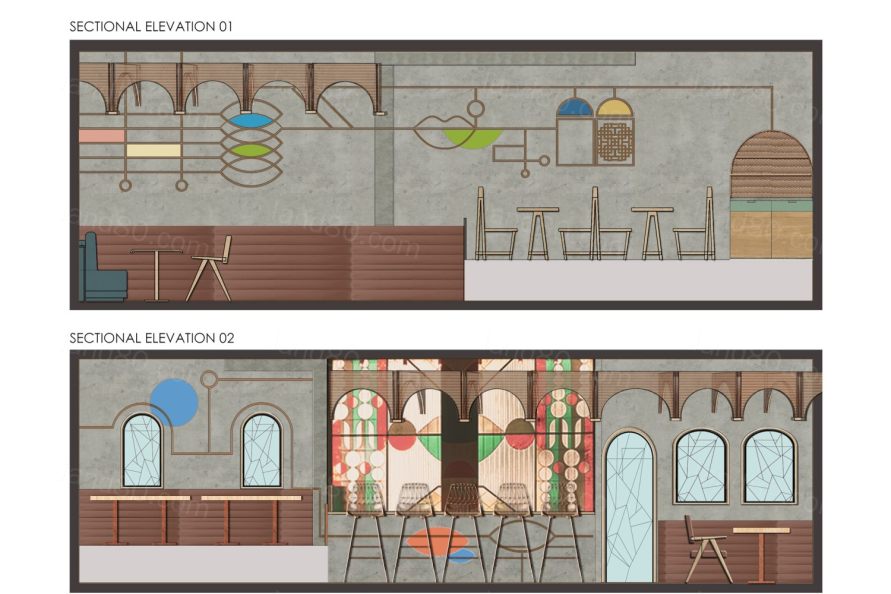
项目名称:MISU
设计单位:FADD工作室
完成:2018年12月
总建筑面积:145平方米
项目地点:印度班加罗尔
首席建筑师:Dhaval Shellugar和Farah Ahmed
照片来源:Gokul Rao Kadam
摄影师的网站:www.meistermeisterphotography.com
摄影师的电子邮件:gokulraokadam@gmail.com
Project Name: MISU
Architecture Firm: FADD Studio
Website:http://faddstudio.com/
Contact e-mail: info@faddstudio.com
Firm Location: Bangalore, India
Completion Year:Dec 2018
Gross Built Area: 145 sq.m
Project location: Bangalore, India
Lead Architects: Dhaval Shellugar and Farah Ahmed
Lead Architects e-mail: dhaval@faddstudio.com , farah@faddstudio.com
Photo credits: Gokul Rao Kadam
Photographer’s website:www.meistermeisterphotography.com
Photographer’s e-mail: gokulraokadam@gmail.com
|