
我对你们说过:一切都在我的眼底,从旅程第一步起。---------阿多尼斯
Wutopia Lab 设计的白色苏州伴宅(林渡陶庐)Section homestay于2021年十月在太湖之滨的西林渡村落成开放。它由是由同程旅行旗下景程文旅投资并由陶庐品牌民宿运营管理的,属于同程旅行与横泾政府共同打造开发的乡村振兴项目林渡暖村里的第一个样板建筑。
The White Section Homestay designed by Wutopia Lab in Suzhou was opened in October 2021 in West Lindu Village on the shore of Taihu Lake. It is invested by Jingcheng Culture Tourism Development (Suzhou) Co., Ltd, a subsidiary of TONGCHENGTRAVEL, and managed by Taolu Brand homestay. The White Section Homestay is the first prototype building that is a rural revitalization project developed by TONGCHENGTRAVEL and the Hengjing government in Lindu Warm Village.

我想轻松一点 I Would Like To Relax.
看基地那天天气极好,我沐浴在金黄色的冬日里居然有些醉。我想在这样安静干净的村子里无所事事发呆,对我这个疲于奔命的中年人来说是多么有吸引力啊!我希望伴宅能够表达这种轻松又一丝慵懒的状态,而不是处处斤斤计较的精确。
The weather was excellent when I visited the site. I was even a little drunk in the golden winter day. The most attractive to me, a middle-aged man, is in a daze in such a peaceful and tidy village to ease the pressure from struggling life! I hope that the Section Homestay could express this relaxed and lazy state, rather than haggle over every ounce with precision.
切一半 Cut In Half
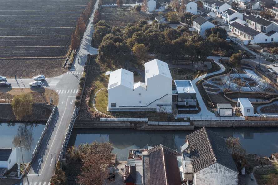
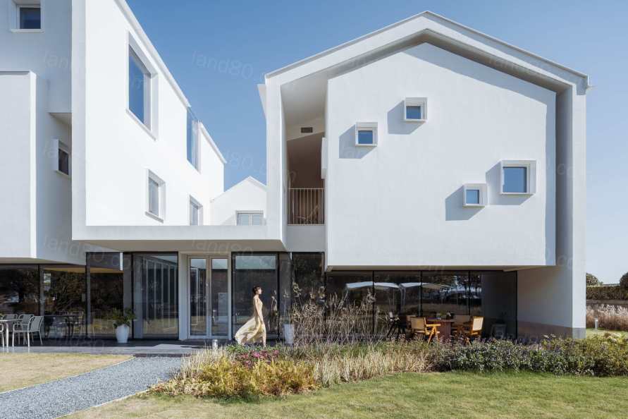
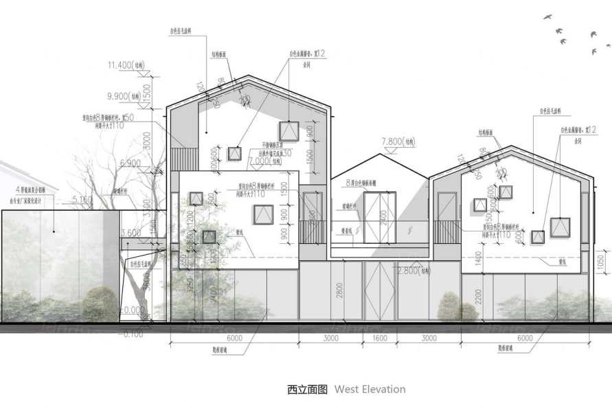
伴宅是对原基地的已经危房状态的房屋修缮改造,建筑师是不能改变建筑的平面轮廓线。有趣的是苏州的郊区农村建筑并不是合院,而是一个反C的布局。看上去是合院的一半。这个一半激发了我的灵感。一半就一半吧,我决定把西立面设计成剖面而暴露出内部的空间组织。伴宅仿佛是把一个完整的合院一分为二分家而留下的一半房子,这是伴宅Section homestay的由来。看得见的半宅和看不见的半宅才是完整意义的伴宅,一个典型的苏州合院。
The Section homestay is the redesign and reconstruction of the dilapidated house on the original site. The architect cannot change the footprint of the building. It is interesting that the rural buildings in the suburbs of Suzhou were not courtyards, but an “C” layout. It seems to be half of the courtyard, which inspired me. Half is fine, I decided to design the west facade as a section to expose the internal spatial organization. The Section homestay seems to be the half of the house left by dividing a complete courtyard into two separate houses. This was the origin of Section homestay. The visible half house with the invisible half house were the complete Section homestay, a typical Suzhou courtyard.

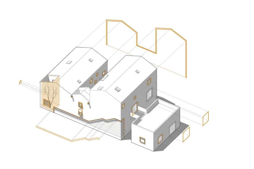
△形态生成分析图
外壳 Shell
既然是剖面,我决定把建筑的外轮廓线看成一个连续的有厚度的外壳。外壳从墙面到屋面的厚度控制在相同的300mm。没错,要在西立面非常清晰地看到这个剖断。为了保持这个连续的剖断,屋顶没有使用江南常见的青瓦而是用白色铝盖板保持在视觉上和白色墙体的连续性。考虑到坡屋顶自由落水同时不能破坏剖面的连续,就特地在檐口设计了一个白色金属批水,帮助雨水抛离墙面。
Since it is a section, I decided to treat the outer contour of the building as a continuous shell with thickness. The thickness of the shell from the wall to the roof is controlled at the same 300mm. That's right, this section should be seen clearly on the west facade. In order to maintain this continuous section, I did not use the common blue tiles for the roof in Jiangnan region, but used a white aluminum cover to maintain visual continuity with the white wall. Considering that the sloping roof should fall freely while not destroying the continuity of the section, a white metal cover flashing was specially designed on the cornice to help the rainwater drop away from the wall.

刻意消失的猪圈 A Deliberately Disappeared Pigpen
原建筑北侧有个独立的方形的猪圈,现在是餐厅的包间。我没法把它和主体建筑在视觉上连续成一体。那么我决定用反射的不锈钢板作为外立面通过吸收周围的景色来让它消失。从而保证主体建筑的完整独立。
There used to be an independent square pigpen on the north side of the original building, which is now a private room of the restaurant. I could not visually integrate it with the main building. Then I decided to use reflective stainless-steel panels as the facade to make it disappear by absorbing the surrounding scenery, so as to ensure the integrity and independence of the main building.


秋千 Swing
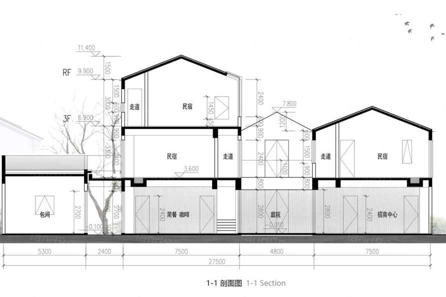
民宿有6间房子,就是6个体积。鉴于我对农村为数不多的记忆是学农时农场晒谷场的秋千。我决定在视觉上创造房间如同秋千是被悬吊起来,去填充腔体的。它们要在剖面上体现悬挂在大空间的首层上方。如果有些微微摆动感就更好了。但这给结构和设备造成了一定的难度。胡文晓采用底部框架抗震墙砌体结构形式,来经济性地解决首层公共活动要求大空间与上部悬挂的民宿空间之间底部轴网错位的矛盾, 在二层楼面采用钢筋混凝土悬挑梁加挂板,三层则外承重砖墙内收,最后在屋面钢筋混凝土板与外承重砖墙通过宽扁圈梁错位连接的方式帮助建筑师达到了在西侧剖立面上展示一种悬吊以及外壳和内腔体积具有空隙的效果。
The homestay has 6 houses, which are 6 volumes. In view of the fact, my few memories of the countryside are the swings in the sun-dried rice field when learning farming. I decided to create the room visually as if a swing is suspended to fill the cavity. They should be suspended above the ground floor of the large space in the section. It is even better if it feels a little wiggly. This created certain difficulties for the structure and equipment. Hu Wenxiao adopted the bottom frame seismic wall masonry structure to economically solve the contradiction between the large space required for public activities and the dislocation of the bottom axis network between the upper-hung room space on the first floor. On the second floor, reinforced concrete cantilever beams with hanging slabs were added. On the third floor, the external load-bearing brick wall is retracted. Finally, the reinforced concrete slab on the roof and the outer load-bearing brick wall are connected by wide flat ring beams to help the architect achieve the effect of suspension and a gap created by the outer shell and the inner cavity on the west section.
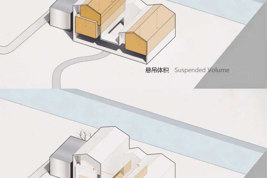
△体量分析图
剖面就是立面 The Section Is The Facade
最后当你从西立面进入建筑前,就可以在这个似乎被切开的断面上隐约洞悉这个建筑的组织结构了。
Finally, when you enter the building from the west facade, you can have a vague insight into the organizational structure of the building on this seemingly cut section.
东立面 East facade
我在其他三个立面以及屋面维持了封闭感来强化外壳的视觉特征以及整个建筑的体积感。其中东立面作为山墙尤甚。
I maintained a sense of closure on the other three facades and the roof to enhance the visual characteristics of the shell and the volume of the entire building. Especially the east facade, which is the gable.
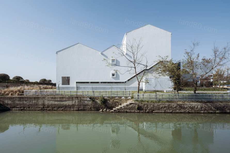
长卷 Long roll
不过东立面临水,于是我设计了一条长达16.4米沿着楼梯到达二层的长窗。于是窗外的风景便如画卷徐徐在游客的行进中打开。长卷不仅在水平方向跨过柱网,而且在竖向跨过楼层。结构工程师只能通过承重构件剪力墙竖向尺寸变化和窗顶以下范围墙体内收,做到不影响带窗的连续性。并在跨层处楼层结构主梁沿窗顶设计成竖向折梁,满足了长窗跨层连续的效果。
As the east f açade towards the river, I designed a long window with a length of 16.4 meters along the stairs to the second floor. Therefore, the scenery outside the window is slowly opened as the tourists move. The long roll not only crosses the column net in the horizontal direction, but also crosses the floor in the vertical direction. Structural engineers can only use the vertical dimension change of the load-bearing component shear wall and the retraction of the wall below the window roof, so as not to affect the continuity of the window. The main beam of the floor structure at the cross-floor is designed as a vertical folding beam along the top of the window, which satisfies the continuity of the long window across the floor.

调皮一下 Play A Joke
长窗在东立面上太具有控制性了。甚至有些生硬。我临时决定改一下设计。把长窗的窗套做了延伸。顶板伸长到北立面后折而落地,南窗套板直接落地。两者之间的涂料在肌理和颜色上和主墙面用材形成一个细微的差异。这个不容易发现的不纯粹大约是我这个江南人内心深处对纯粹的几何体的一种欲拒还迎的怀疑。
The long window is too controllable on the east facade, even a little blunt. I decided to change the design temporarily. I extended the window cover of the long window, stretched the top slab to the north facade and then folded to the ground, while the south window cover slab directly fell to the ground. The paint between these two parts forms a slight difference in the texture and color with the main wall material. This impureness that is not easy to find is probably a kind of suspicion that, a Jiangnan person like me, has a desire to reject and welcome pure geometry in my heart.
那就改改其他 Then change other
我继续修改东立面后,重新设计了东立面的排水口和厨房以及二楼公共休息区窗子的窗套。它们在满足功能的同时又要强化东立面的封闭感。
After continuing to modify the east facade, I redesigned the drain, the window cover of kitchen on the east facade, and of the public rest area on the second floor. While satisfying their functions, they must also strengthen the sense of closure of the east facade.

腔体 Cavity
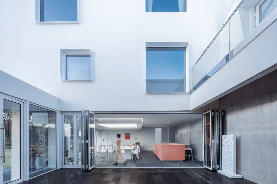
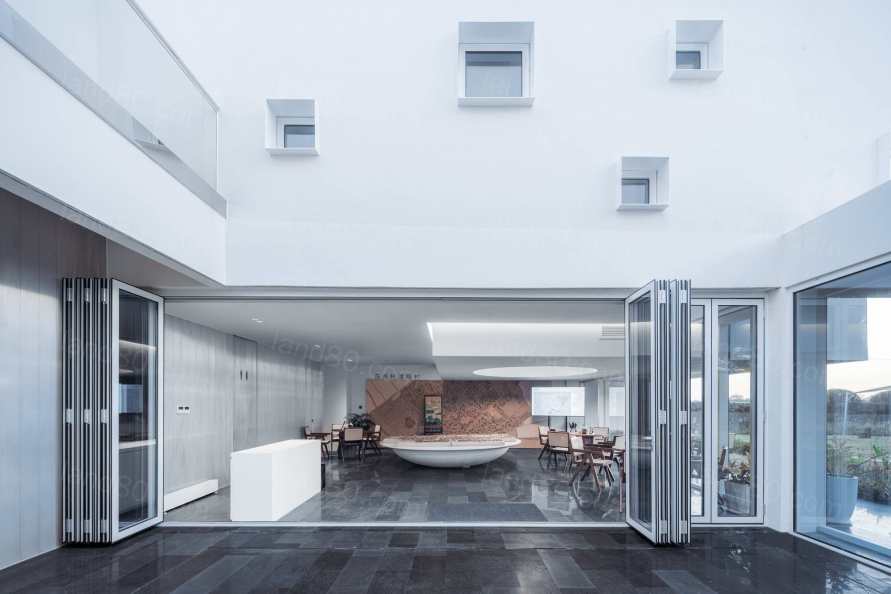
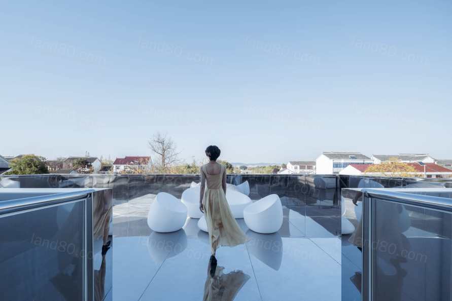
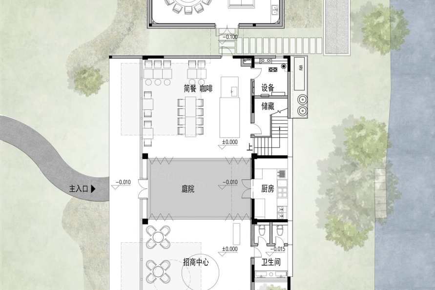
然后我把建筑内部看成是腔体。任何腔体都不太会像现代建筑那样被各种功能空间挤得满满的。所以我决定释放首层空间,模糊室内外的界限,我把首层定义为腔体里的空。它可以用来休息,展示或者喝点什么。那么二楼以上的民宿空间,我把他们看成腔体里的器官。我把每一个房间都看成独立的体积(器官)而不是把所有房间包括走廊看成一个统一的体积来安置在这个腔体之中。
Then I regarded the interior of the building as a cavity. Any cavity is unlikely to be filled with various functional spaces like modern buildings. Therefore, I decided to release the first-floor space and blur the boundaries between indoor and outdoor. I defined the first floor as the void in the cavity. It could be used to rest, show or drink. For the guesthouse space on the upper floors, I regarded them as organs in the cavity. I treated each room as an independent volume (organ), instead of treating all rooms including the corridor as a unified volume to be placed in this cavity.
还黑于地 Give Black Back To The Ground
首层的地面包括庭院地坪,我统一使用了黑色火山岩。我解释是将屋顶的黑色用于地坪。实际还是出于避免彻底的白色以及我最近一直在尝试的水墨调子的实验。黑色地坪也成功地将二层空间以及外壳和地面剥离开而强化的悬吊体验。
I use black volcanic rock for the ground on the first floor includes the courtyard uniformly. I explained that the black of the roof was used for the floor. In fact, it is out of avoiding the complete white and the experiment of ink painting tone that I have been trying recently. The black floor also successfully separated the second-floor space, the shell and the ground to enhance the suspension experience.
凿壁取光 Gouging For The Light
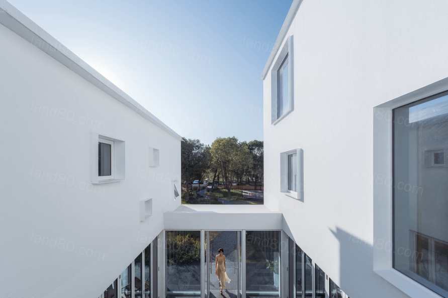
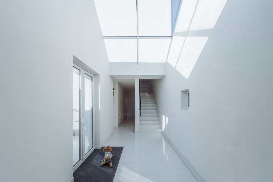
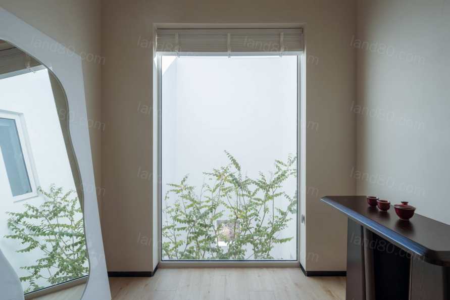
我把院子和窗子看成民宿这个连续的外壳上被凿出来的洞口。你可以坐在阴影里,看着光线从洞口倾泻而下,一切都很安静。南面白色小院子里的紫薇则把这种安静变得生动。
I regard the yard and windows as holes cut out from the continuous shell of the homestay. You can sit in the shadows and watch the light pouring down from the hole, everything is quiet. The crape myrtle in the small white courtyard to the south brings this quietness to life.



江南在哪里 Where is Jiangnan
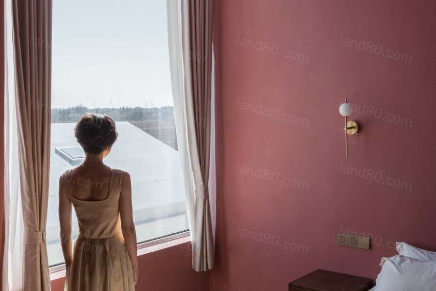
这个白色的房子在效果图上会让人觉得有些不江南,但建成后从鸟瞰来看,并无违和感。事实上吴冠中提炼的那个三分黑七分白的江南视觉已经离我们有些远了。不仅房屋形制改了,甚至屋顶的青瓦也被当地居民放弃了。当代的江南有些斑驳,而吴冠中的那个江南则在记忆中。我选择完整的白色不过是想做个减法,去消弭那个斑驳的江南的迷乱而已。我在三楼的客房选用了红色,则是我另外一种遗憾。如今江南的普通人饭桌上都充斥着白酒。袁枚热爱的黄酒几乎消失在主流的江南饭桌上了。黄酒虽然是米酒,但用麦做曲,所以呈现琥珀色。西林渡村有过相当知名的酿酒历史。我于是用了酒糟的红色来粉饰了三楼的两间房。大约算是对某些消亡事物的倔强表达吧。
The renderings of this white house will make people feel a little bit unsuitable in Jiangnan, but from a bird's-eye view after completion, there is no sense of disobedience. In fact, the three percent black and seven percent white Jiangnan vision refined by Wu Guanzhong is far away from us. Not only the shape of house was changed, but even the blue tiles on the roof were abandoned by the local residents. The contemporary Jiangnan is a bit mottled, but Wu Guanzhong's Jiangnan is in memory. My choice of complete white is just to make a subtraction to eliminate the confusion of the mottled Jiangnan. I chose red for the guest room on the third floor, which is another kind of regret. Nowadays, ordinary people in Jiangnan are flooded with Baijiu on their dinner tables. Yuan Mei's favorite rice wine has almost disappeared from the mainstream dinner table of Jiangnan. Although rice wine is made from rice, it uses wheat to make koji, so it has a color of amber. West Lindu Village has a well-known history of winemaking. Therefore, I used the red vinasse to decorate the two rooms on the third floor. It is probably a stubborn expression of some things that are dying.





万物静默如谜 Everything is silent like a mystery
我原没有在房间安置电视机,是因为我从自己的体验出发想营造一种静默的气氛、颜色、光线、封闭感,对风景的限制性使用。我们在日常中声色太过丰富以至于心神不安。我希望在这里外挂的设备都可以暂放一边。阳光会微微灼热你,空气有些缓慢,偶尔有些虫鸣。我或者你可以懒洋洋地无所事事,然后有了兴趣,这万物为何静默如谜。
I did not place a TV in the room because I would like to create a quiet atmosphere, color, light, sense of closure, and restrictive use of the scenery from my own experience. We are so rich of sound and color in our daily lives that we feel uneasy. I hope all the external devices can be put aside temporarily. The sun will warm you slightly, the air will be a little slow, and some insects will sing occasionally. Me or you can do nothing lazily, and then become interested, why is everything silent like a mystery.


每一个瞬间,灰烬都在证明它是未来的宫殿 ----------阿多尼斯
▽总平面图

▽一层平面图
▽二层平面图

▽三层平面图

▽西立面图
▽东立面图

▽剖面图
项目信息:
设计公司: Wutopia Lab
主持建筑师:俞挺
项目建筑师:黄河
设计团队:李子恒、庄寅霏(实习)
深化公司:上海三益建筑设计有限公司
深化团队:祝宇梅、胡文晓(结构)、石佳莹、毛浡、茅娅倩、王粲、于兵、沈睿
照明顾问:张宸露、尉诗羽、陈幸如、刘雪怡
植物顾问:刘悦来、谢文婉
业主:景程文化旅游发展(苏州)有限公司
地点:江苏省苏州市吴中区横泾街道上林村西林渡1号
面积:556平方米
建成时间:2021年10月
材料:外墙涂料、铝单板、钢、铝塑板、火山岩、微水泥、水磨石等
摄影:CreatAR Images
视频:CreatAR Images
Design Firm: Wutopia Lab
Chief Architect: Yu Ting
Project Architect: Huang He
Design Team: Li Ziheng, Zhuang Yinfei (Intern)
Document Development: Shanghai Sunyat Architecture Design Co., Ltd.
Development Team: Zhu Yumei, Hu Wenxiao (Structure), Shi Jiaying, Mao Bo, Mao Yaqian, Wang Can, Yu Bing, Shen Rui.
Lighting Consultant: Chloe Zhang, Wei Shiyu, Chen Xingru, Liu Xueyi
Plant Consultant: Liu Yuelai, Xie Wenwan
Owner: Jingcheng Culture Tourism Development (Suzhou) Co., Ltd
Location: No.1 West Lindu, Shanglin Village, Hengjing Street, Wuzhong District, Suzhou, Jiangsu
Building Area: 556.0㎡
Project Time: 2021.10
Material: Exterior wall paint, aluminum veneer, steel, aluminum composite panel, volcanic rock, micro cement, terrazzo, etc.
Photography: CreatAR Images
Video: CreatAR Images
|