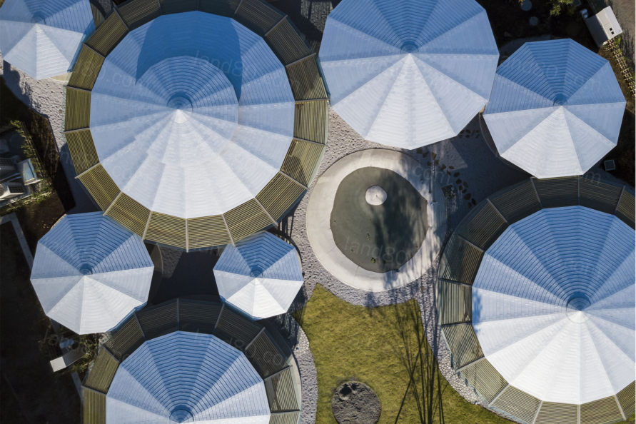
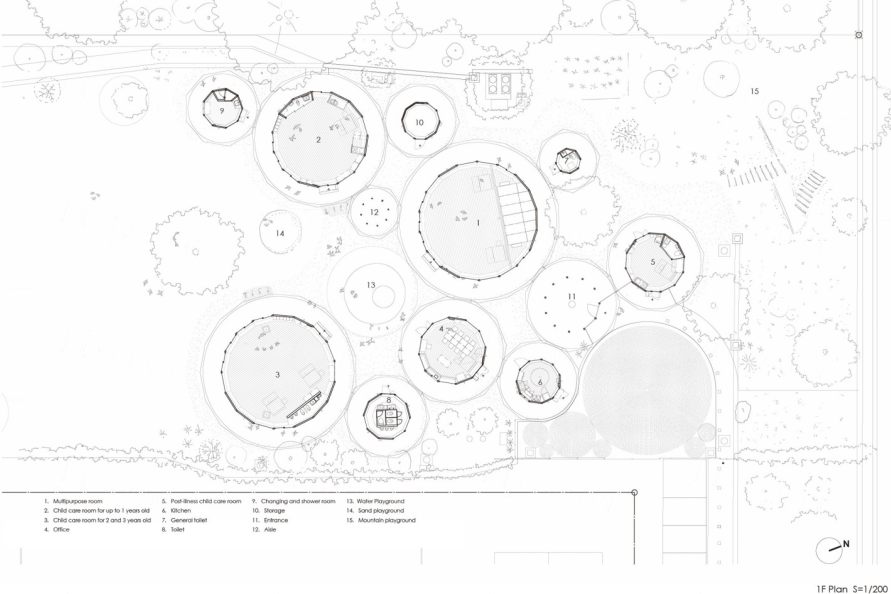
与其说项目像是很多“圆圈”,不如将其形容为“泡泡”,项目看起来就像在空气中慢慢升起的气泡,保持着彼此之间的最佳距离。每个“泡泡”只有一种功能,里面没有墙,就像一个由细胞器、线粒体、核糖体等支撑的单细胞有机体一样,由家具和低矮的隔板支撑。
It should be named bubble rather than circle planning. The plan is looking like bubbles slowly rising up in air keeping optimum distance between each other. Each bubble has only one function. There is no wall inside. Like a single-cell organism supported by organelles, mitochondria, ribosomes, etc., each bubble is supported by furniture and low partitions.
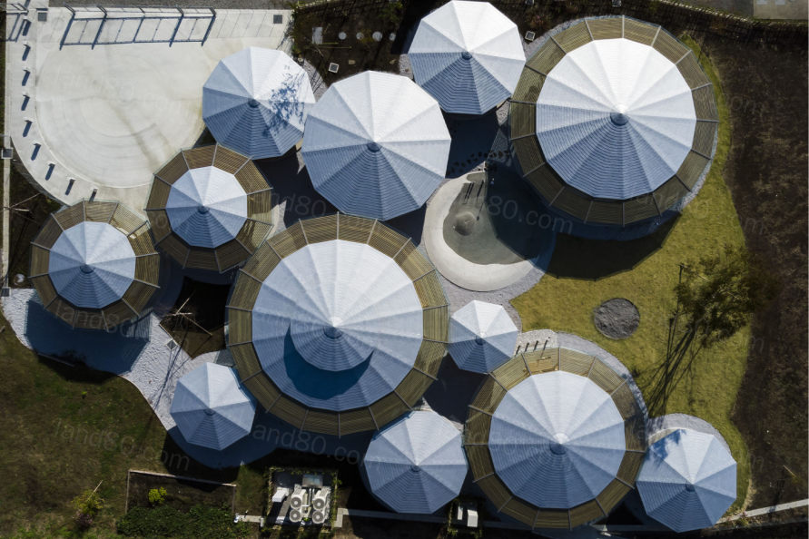
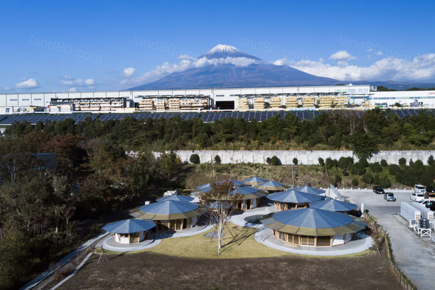
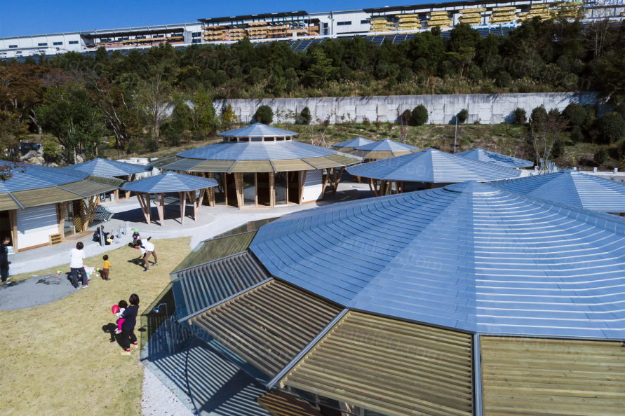
项目一开始非常的不被看好,因为空间内结构复杂,布置家具不容易。我们都很同意这一点,但我们发现,与传统的方正的空间相比,这种空间梳理有显著的优势。
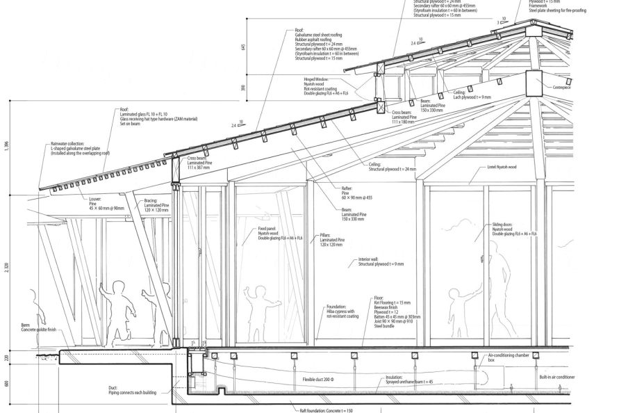
There is always criticism about the circular plan. It is not easy to arrange furniture. Structure is complicated. I have no objection against those, yet we found there are significant advantages on this circle planning compared to conventional modular planning.
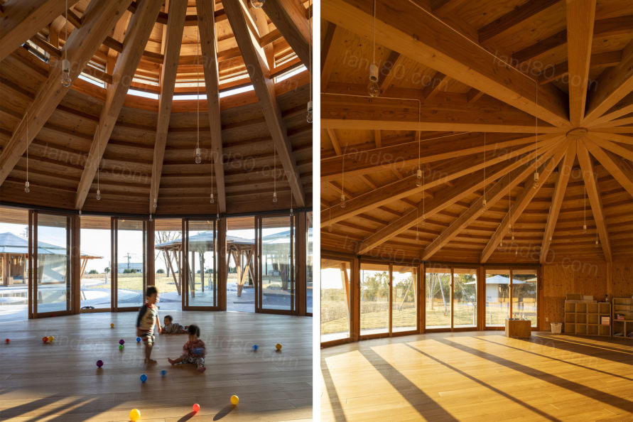
首先,每个功能的定位完全不受几何限制。通过分析规划,将每个房间安排在合适的位置,每个房间的大小可以自由调整。
First of all, the positioning of each function is completely free from geometrical restrictions. Each room can be located as it is analyzed on diagram. The size of each room can be adjusted freely.
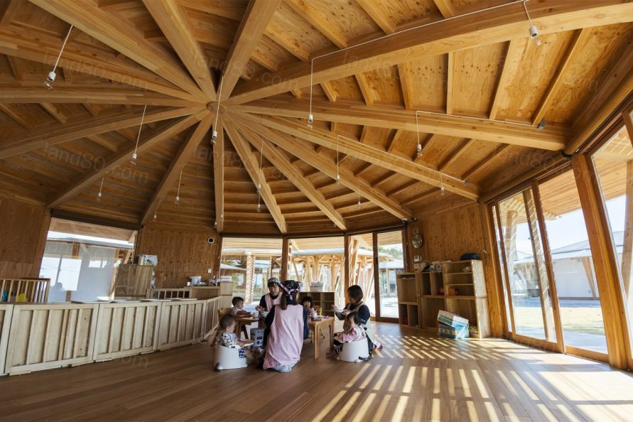
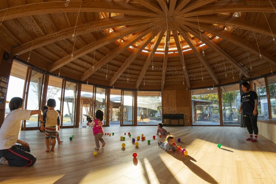
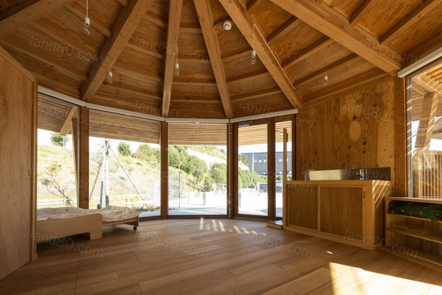
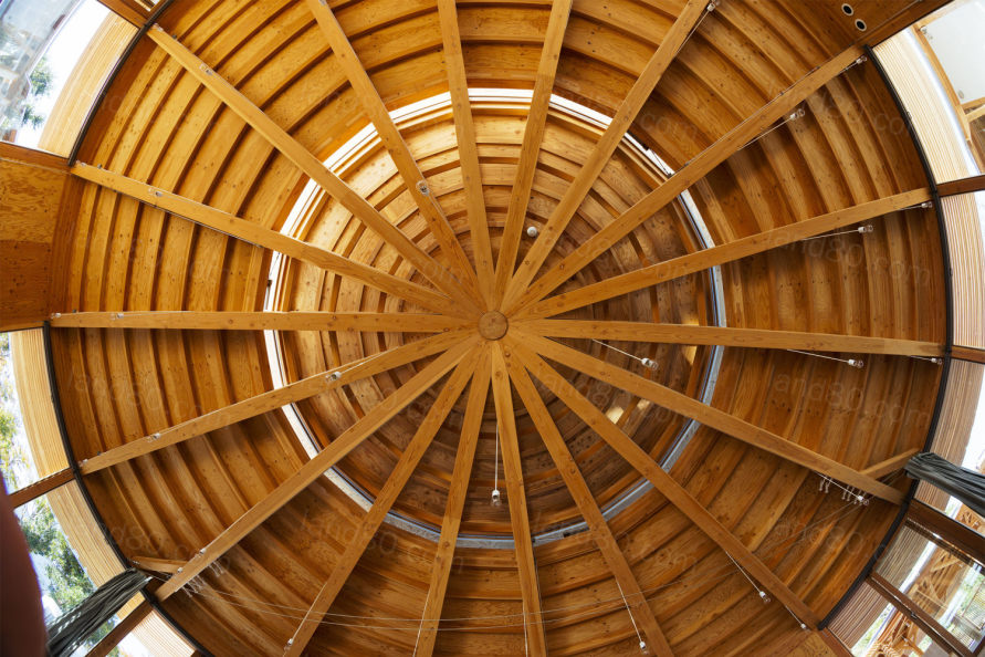
其次,项目中的能见度很好。“视线的可达性”是幼儿园和托儿所最重要的要求之一。圆形的外形自然带来360度的能见度,“气泡”之间形成的缝隙提供了良好的视线可达性,从办公室还能船上和桥上的景色。
Secondly, the visibility is excellent. Visibility is one of the most important requirements of a kindergarten and nursery school. The round shape brings 360 degree visibility naturally. The gap formed between bubbles provides glimpses from one end to the other side. The view from the office is very close to the one from the bridge of a ship.
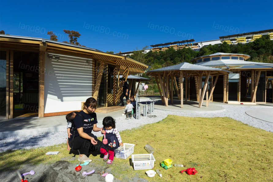
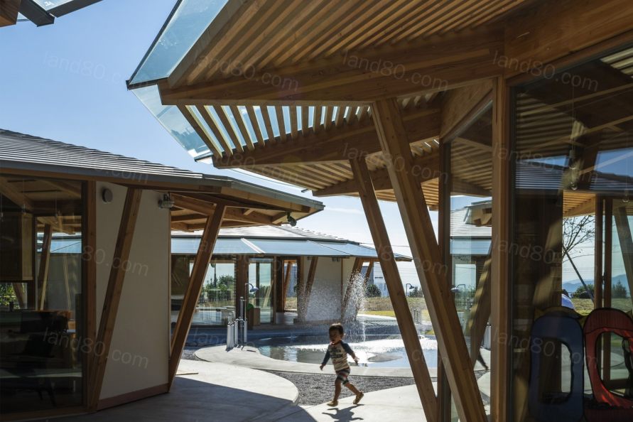
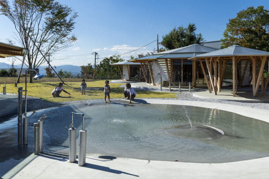
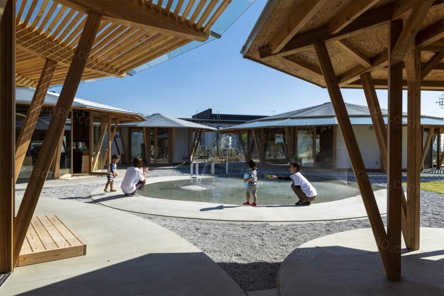
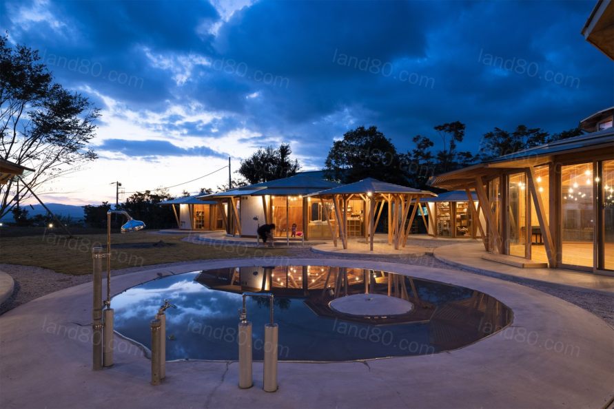
第三,圆形的造型激发了孩子们“无限”的运动,这是孩子们精力充沛的本能。这些圆彼此相连,创造了无限的组合。但只有一个“泡泡”可以让孩子们穿过,那里没有台阶,只有缓坡,深度只有30厘米。在冬天,水被排干了,池子变成了一个空“盘子”,孩子们在此玩耍嬉戏。
Thirdly, the round shape provokes the endless circular movement of children. It is endless instinctive movement. The circles are linked with each other and create infinite combinations. There is only one circle which allows children to cross. It is a dish of water for children. There is no step but only a gentle slope and the depth is only 30 centimetres. In the winter, the water is drained and the pool becomes an empty dish where children show motion of procession.

设计单位:Tezuka Architects
项目类型:幼儿园
地点:日本静冈县富士市
设计时间:2016年11月-2017年6月
工期:2017年7月-2018年2月
场地面积:5497.99m2
建筑面积:537.19m2
总建筑面积:403.51m2
主要结构:木材
结构工程:Ohno JAPAN/Hirofumi Ohno,Satoshi Fujimoto
景观设计:10 kei/Keiichi Ishikawa
照明设计:Bonbori Lighting Architect&Associates,inc./Masahide Kakudate,Toshio Takeuchi
施工:Sato Construction/Shingo Karuishi, Takeru Kojima
艺术总监:Marukin Ad / Hideaki Okada, Mai Kanno, Erika Yamagishi
Main use: Nursery School
Location: Fuji City, Shizuoka Prefecture, Japan
Site area: 5497.99m2
Building area: 537.19m2
Total floor area: 403.51m2
Number of stories: 1
Structure: Timber
Architects: Tezuka architects / Takaharu+Yui Tezuka, Kenta Yano
Structural Engineering: Ohno JAPAN / Hirofumi Ohno, Satoshi Fujimoto
Landscape Design: 10-kei/Keiichi Ishikawa
MEP: Office May / Yousuke Hitomi, Minami Yuya, Masami Oshima
Lighting Design: Bonbori Lighting Architect & Associates, inc. /Masahide Kakudate, Toshio Takeuchi
Construction: Sato Construction/Shingo Karuishi, Takeru Kojima
Art director: Marukin Ad / Hideaki Okada, Mai Kanno, Erika Yamagishi
Design period: Nov. 2016—Jun. 2017
Construction period: Jul. 2017—Feb. 2018
|