斯图加特国家图书馆的建筑是德国南部60年代杰出的建筑成就之一。该建筑以其宽大的空间序列、精心的材料选择和高质量的结构实施给人留下深刻印象。在城市规划的定位下,当时的建筑师最初反应的是交通轴线所决定的。这条街道的空间理念是基于现代主义的概念,将独立的建筑置于一个具有张力的空间场中。这个概念几乎颠覆了历史街道空间的局面。如果从战前的照片和规划图上看以前的内卡大街,就会发现街道两边的空间都是有代表性的建筑,这些建筑的优点我们今天又学会了欣赏。当人们想在康拉德-阿登纳大街(Konrad-Adenauer-Strasse)上走一走时,这条并不华丽但却很受人尊敬的林荫道的损失就会变得很明显。
The construction of the state library in Stuttgart is one of the outstanding architectural achievements of the 1960s in southern Germany. The building impresses with its generous sequence of rooms as well as the careful choice of materials and the high quality of the structural implementation.With the urban planning position, the architects of the time initially reacted to the traffic axis dictated by the traffic. The spatial idea of this street was based on the modern idea of wanting to place free-standing structures in a spatial area of tension. The concept turned the situation of the historical street space on its head. If one looks at the former Neckarstrasse on photos and plans from the pre-war period, one recognizes the street space lined with representative architecture on both sides, whose advantages we have come to appreciate again today. The loss of this not lush, but nevertheless respectable boulevard becomes clear when one is tempted to walk down Konrad-Adenauer-Strasse as a pedestrian.
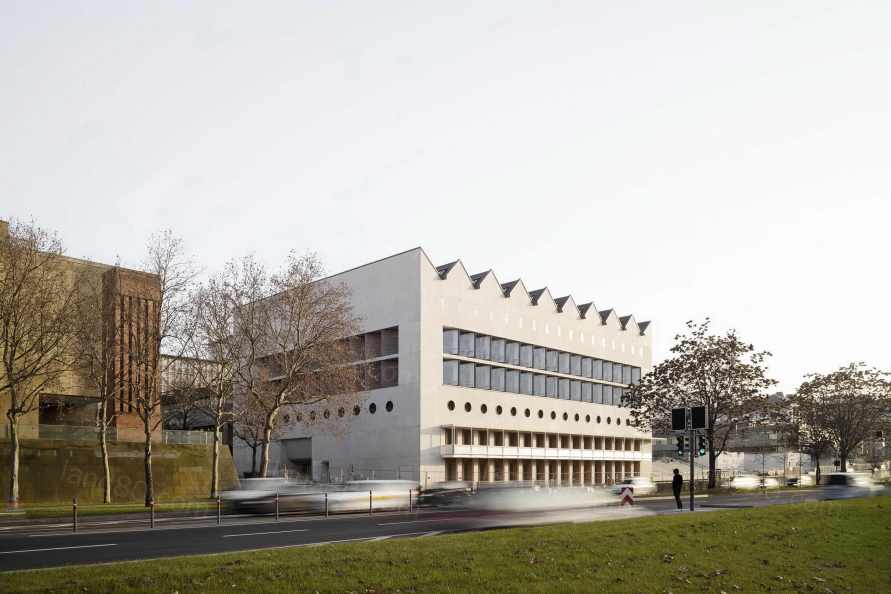
尽管人们对现代主义的事迹充满了热情,包括试图通过宽阔的车道和地下的隧道使汽车的流动更加灵活,这在六十年代被誉为进步的见证,但看到城市规划的情况,没有人真正热心。现在,汽车里的自由驰骋与行人的扼杀形成了鲜明的对比:在某些地方,道路只能通过一些被认为是荒凉的洞口或通过人行天桥来行驶。这些和国家图书馆有什么关系?嗯,道路的拓宽意味着图书馆已经迁移到了城市的另一个地方,与战后之前的情况不同,在情感上已经不再是城市最内部的一部分。当时,图书馆和高查理学校正对着街。空间关系在历史上和象征上都是有意义的。今天,这些建筑彼此之间没有任何进一步的关系:宫殿的背面简陋,从来没有打算作为一个展示性的立面,而图书馆的自给自足但美丽的建筑则是上世纪60年代的。
Despite all the enthusiasm for the deeds of modernity, including the attempt to make the flow of cars faster through wide lanes and under tunnels, which was approved in the sixties as a testimony to progress, no one was really enthusiastic about the urban situation. The free ride in the car was now faced with the maneuvering of the pedestrian: the road could only be overcome in a few places through holes that were perceived as inhospitable or over footbridges. What does all of this have to do with the state library? Well, with the expansion of the street, the library has moved to another part of the city and, in contrast to the situation until after the war, emotionally no longer part of the inner city. Back then, the library and the high Charles School were directly opposite each other. The spatial relationship made sense both historically and symbolically. Today the buildings stand without any further relation to each other: the modest rear of the castle, which was never intended as a show facade, and the self-sufficient but beautiful building of the library from the sixties.

因此,国家图书馆扩建工程的竞争,不仅提出了如何巧妙地对老建筑进行功能和空间上的延伸,而且提出了改善城市状况的问题。是否可以用新的建筑创造一个空间,成为未来林荫道的一部分,而不采用旧的建筑方案?考虑的出发点一方面是直接在康拉德-阿登纳大街上的建筑,以便给这个空间一个框架。另一方面,除了在一楼连接一座桥梁外,要尽量减少对老建筑的干预。紧凑性最终也是为了满足低施工成本的期望。现在,扩建部分直接占据了Ulrich-和Konrad-Adenauer-Straße的街角。这条人行道从国家歌剧院的树荫大道开始,一直到乌尔里希大街前结束,一直延续到夏洛滕广场。该建筑大致处于Wilhelmspalais的屋脊高度,为了在两座建筑之间引出一条连接Urbanstraße和建筑群下层的小路,与老建筑保持一定距离。新建的地下停车场(老建筑因技术和建筑规定无法再维持)在原入口层形成了一个宽敞的广场,广场的另一侧是国家档案馆。在城市空间上,旧阅览室的立方体,现在占据了新广场的中心,与新宫殿的中央立面建立了关系。宽敞的楼梯提供了与新的街道路面的连接。
With the competition to expand the state library, the question arose not only of how the old building could be expanded functionally and spatially, but also how to improve the urban situation. So can a space be created with a new structure that can be part of a future boulevard without resorting to old building schemes? The starting point of the considerations was on the one hand the setting of the building directly on Konrad-Adenauer-Straße in order to give this space a new frame. On the other hand, the encroachment on the old building should be minimized, except for a connection to a bridge on the first floor. Ultimately, the compactness also served to meet the expectations for low construction costs. The extension now occupies the corner of Ulrich- and Konrad-Adenauer-Strasse. The pavement, which, beginning with Baumallee at the Staatsgalerie, has since ended in front of Ulrichstraße, will continue to Charlottenplatz. The structure, which is roughly the height of the ridge of the Wilhelmspalais, is set at a distance from the old building in order to lead a path between the two buildings that connects Urbanstrasse with the lower level of the building complex. The new construction of the underground car park (the old construction could no longer be maintained due to technical and building regulations) creates a generous space at the level of the previous entrance level, which is flanked on the other side by the State Archives. In terms of urban space, the cube of the old reading room, which now occupies the center of the new square, creates a relationship with the central projection of the new palace. A spacious staircase creates the connection to the new sidewalk at street level.

现在,这栋楼的两层都可以进入。下层还设有咖啡厅,咖啡厅向街道开放,可以独立于图书馆业务开放。图书馆的 "实际 "主入口在上面一层。从这里可以到达门厅,门厅里有必要的咨询台、安全区的入口、还书处以及通往康拉德-阿登纳大街的大厅和展览区。在那里,由于经济原因,正常层数的净高大大降低,所以房间高度部分是双层的。
The building can now be reached on both levels. The lower level also houses the cafeteria, which opens onto the street and can be open independently of the library. The “actual” main entrance to the library is on the level above. From there you can reach the foyer with the necessary counter for information, access to the secure area, book return and a hall and exhibition area that opens onto Konrad-Adenauer-Straße. There the room height is partly two-storey, as the clear height of the normal storeys is significantly lower for economic reasons.

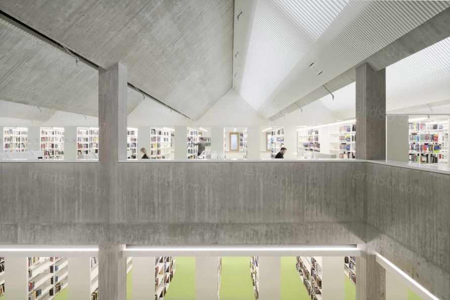
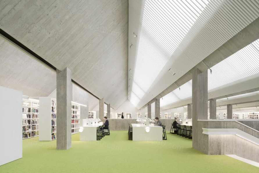
在一楼,可以通过安全区域的楼梯进入,在楼梯的尽头直接建立了与老建筑的连接。平面图的中央区域被架子占据。沿着两条长长的边,阅读的地方向大厅一字排开,而另一边则是额外的行政室。这一层与上面的其他楼层有明显的空气空间连接。在二楼和三楼,阅读场所沿外墙平展。而顶层则是反向组织。在那里,阅读的地方被放置在平面图的中间,因为在这个层面上,我们可以通过折叠式屋顶结构将日光引导到房子的中心。新的扩建部分并不打算作为一个独立的结构出现,但实际上在视觉上只是更大的旧建筑的延伸。因此,旧建筑的材料化,即在细板模板中裸露的混凝土的特点,在建筑的新部分得到了延续。在外墙方面,采用白水泥和二氧化钛的颜料来达到浅色的效果。裸露的混凝土外墙作为原位混凝土壳体悬挂在承重混凝土墙体前,核心保温层。模板采用粗锯木板,尺寸由现有建筑指定,接缝和钉纹有序,在支撑模板上手工制作,用水泥浆预熟。该工程由Max Bögl公司的基础设施部门负责,该公司通过其桥梁建设活动,在板式公道面混凝土的建设方面具有丰富的经验。
On the first floor, which is accessible via a staircase in the secured area, the connection to the old building is created directly at the end of the staircase. The middle area of the floor plan is covered with shelves. Reading areas are lined up along the two long sides towards the hall, while additional administrative rooms are located on the other side. This level is visibly connected to the other floors above by an air space. On the second and third floors, the reading areas are located along the fanned out facade. The top floor, on the other hand, is organized the other way around: there the reading areas are placed in the middle of the floor plan, as on this level we can direct daylight into the center of the house via the folded roof structure. The new extension is not intended to appear as an independent structure, but actually only represents an extension of the much larger old building. For this reason, the materialization of the old building, characterized by the exposed concrete in fine board formwork, is continued in the new component. For the facade, white cement and pigmentation with titanium dioxide were used for the concrete in order to achieve a light color. The exposed concrete facade is hung in front of the load-bearing concrete walls as an in-situ concrete shell with core insulation. The formwork was made from rough-sawn boards, the dimensions of which were specified by the existing building, with an orderly joint and nail pattern on a beam formwork and pre-aged with cement slurry. The construction was carried out by the infrastructure department of the Max Bögl company, which has extensive experience in the construction of board-clad exposed concrete thanks to the bridge construction.
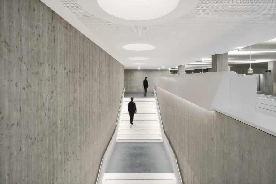

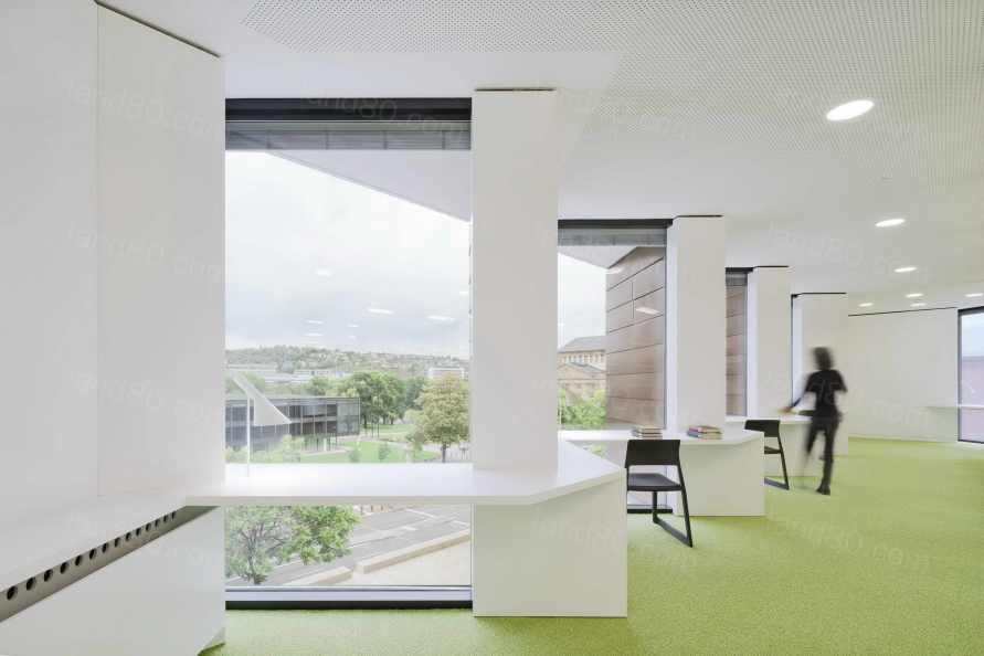
旧阅览室的铜包层在二楼和三楼的扇形外墙的封闭墙面中找到了对应的位置。与现有建筑一样,扩建部分的屋顶也是用铜覆盖的。在建筑内部,出于成本的考虑,取消了混凝土的浅色。一个特别的挑战是图书馆区裸露的混凝土楼梯和四楼北向玻璃棚顶的Z形宽幅梁的混凝土化。这里的模板也是在梁式模板上用粗锯木板手工进行的。在整个建筑中,避免使用反复出现的模板模式的矩阵。因此,从外露混凝土的质量来看,模板工人的努力和技术与浇筑时的天气状况一样,可见一斑。粗糙而有活力的裸露混凝土表面与白色、光滑的吊顶和木板表面并列在一起。浅绿色的地毯和白色的家具营造出明亮欢快的氛围,与现有建筑的淡雅色调形成鲜明对比。
The copper cladding of the old reading room is reflected in the closed wall fields of the fanned facades on the second and third floors. Like the existing building, the roof of the extension is also covered with copper. For reasons of cost, the interior of the building was not colored lightly on the concrete. A particular challenge was concreting the exposed concrete stairs in the library area and the Z-shaped, wide-span girders of the north-glazed shed roof on the fourth floor. Here, too, the formwork was done by hand with rough-sawn boards on beam formwork. There were no matrices with recurring formwork patterns in the entire building. The effort and skill of the formwork builders is just as evident in the quality of the exposed concrete as the weather conditions at the time of concreting. The rough and lively exposed concrete surfaces are contrasted with the white, smooth surfaces of the suspended ceilings and wood paneling. Light green carpeting and white furniture create a bright, cheerful atmosphere that contrasts with the muted colors of the existing building.
大型前庭与老建筑的阅览室以及新建筑的入口立面相接,前庭的结构由一个大型水盆构成,并赋予其生命力。艺术家法勒的喷泉装置,由于S 21的原因,不得不从中央宫殿花园移走,将在那里找到新家。
The large forecourt, which is framed by the reading room of the old building and the entrance facade of the new building, is structured and lively by a larger water basin. There, the fountain system by the artist Faller, which had to fall due to S 21 in the middle palace garden, will find a new home.

Project: Extension of the Württemberg State Library in Stuttgart
Client: State Office for Assets and Construction Baden-Württemberg, Stuttgart Office
Architects: LRO Lederer Ragnarsdóttir Oei, Stuttgart
Staff: David Fornol, Simone Neuhold, Dr. Anwar Algeith, Kazushi Ito, Max Löffler, Sophia Schmidt, Matthias Schneider, Anna Schönhoff, Luise Wegehaupt, Ugur Yilmaz
Outdoor facilities: Lederer Ragnarsdóttir Oei Architects, Stuttgart
and Helmut Hornstein, Überlingen
Structural engineering: Leonhardt, Andrä und Partner, Stuttgart
Planning HLS: ZWP, Stuttgart
ELT planning: Inros Lackner, Rostock
Building physics: GN Bauphysik, Stuttgart
Fire protection: TRIAS, Stuttgart
Competition: 12/2010 - 2nd prize
Construction time: 2015 - 2020
GFA: 20,300 m2
Usable area: 11,300 m2
Location: Konrad-Adenauer-Straße 10, 70173 Stuttgart
Awards:
Hugo Häring Award 2020
BDA Stuttgart / Middle Neckar
Winner of the Concrete Architecture Prize 2020
Federal Association of the German Cement Industry / BDA
Callwey Munich with the BDA (ed.): Beton, 2020, Stuttgarter Zeitung, October 6th, 2020, WLBforum, 22nd year 02 | 2020
Photos: Brigida González, Stuttgart
|